Our site uses cookies to customize your experience and help us analyze each crumb of web data.
LEARN MORE


Color Combo of the Year, According to L&S
By Katelyn Short
- 12.16.20
- 3 Min Read
Every year our designers look forward to Pantone’s Colors of the Year reveal, and last week was no different. We gathered to watch the webinar, debated about our predictions and bubbled with excitement. Do you blame us? This is like the Super Bowl for designers.
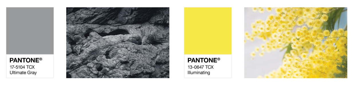
But when Pantone announced the two new colors, we were a bit…disappointed. The color combo wasn’t exactly what we would have chosen. And we know no one asked, but our team couldn’t help but share our opinions. See our top picks below.
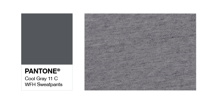
Ty Macconnell, Senior Designer
PANTONE 11 C
I suggest Cool Grey, aka “WFH Sweatpants Grey.” For obvious reasons.
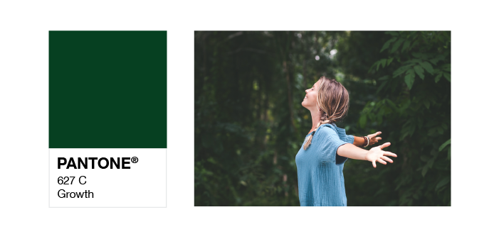
Katelyn Short, Senior Designer
PANTONE 627 C
Green, the color of life, renewal, nature and energy. It represents what was either tested or brought forward in this past year. It’s also associated with growth, safety and the environment—all the things we’ve had to focus on as individuals in a challenging time. Green can bring encouragement and promise, even during a difficult phase in life.
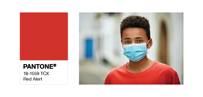
Taylor Hilmoe, Designer
PANTONE 18-1559 TCX
For my color, I’m going to go with Red Alert. Because it represents both the stress everyone has been feeling during 2020 and also serves as a reminder that we must be cautious and prepared for the future days to come.
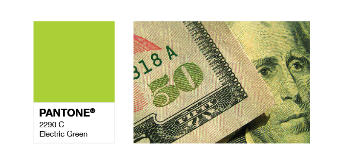
Dan Dismounts, Art Director
PANTONE 2290 C
The color of 2020 was Classic Blue, and that’s how most everyone felt about this last year. Therefore, I chose an Electric Lime Green to hopefully infuse 2021 with lots of energy, optimism and maybe even a little cash money.
Roberta Forman, Art Director
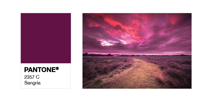
PANTONE 2357 C
Besides the obvious overtones of politics (red + blue = purple), this feels more like something that represents where we are. It’s soft but strong. It’s not light and cheery (because this year def wasn’t), but it doesn’t automatically bring you to dark and dismal.
Blair Gilkyson, Senior Copywriter
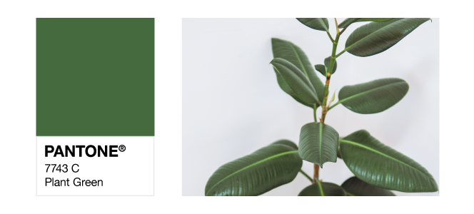
PANTONE 7743 C
I know I’m not a designer, but I helped put this blog together so I’m forcing my input in. The True Gray, in my opinion, is pretty spot on. It’s the color of the groutfits I wore every day for three months while I was in quarantine. It became the unexpected security blanket I found when faced with an uncertainty I’d never experienced before. Fashion trends be damned—groutfits are awesome, and True Gray deserves its Color of the Year title. It deserves more than that, actually. Give it a medal.
Illuminating, on the other hand, is a bit off base to me. I get that the eye-catching yellow represents positivity, optimism and hope—which we all could use right now. But it just didn’t hit the mark. Instead, Plant Green is a great companion color for Groutfit Gray. I’ve had some extra time during COVID to actually care for my neglected, dehydrated apartment plants. And now they’re alive, thriving and a pretty deep green color I think everyone would appreciate. Good things can still grow in bad time, y’all.