Our site uses cookies to customize your experience and help us analyze each crumb of web data.
LEARN MORE


Secrets of a Successful Logo
By Dan Dismounts
- Education
- 03.19.20
- 5 Min Read
As a designer at L&S, I work on a lot of different projects. But logos are some of my favorites. A logo is a foundational brand element that’s got a lot of heavy lifting to do. And creating a good one is the perfect illustration of how design is a balance of artistry and strategy.
In case you’re taking a second look at your logo, I’ve compiled a (mostly) complete guide on what makes a successful logo and how to embark on the process.
WHAT A LOGO IS – AND ISN’T
A logo is a visual identifier for a brand. It’s extremely important. That said, it’s not your entire brand. A logo should be a key part of a larger branding effort that represents your company – its vision, voice, user experience, overall aesthetic, values and more.
Logos are important because the best ones not only represent the product but represent what the entire brand stands for. A truly great logo that’s built on insight can last the test of time and drive tremendous return.
TRAITS OF A STRONG LOGO
A good logo can establish credibility, signal innovation, inspire action and serve as a rallying cry that unites people to your cause. At L&S, we have a lot of branding projects under our belt for some of the region’s largest companies and organizations. In all of these projects, big and small, we believe the strongest logos are rooted in five key factors:
1. ALIGNMENT
A logo needs to stand for something, being closely aligned with an organization’s key mission, values, differentiators and vision. This not only ensures the logo has a big impact, but that all efforts stemming from it do as well.
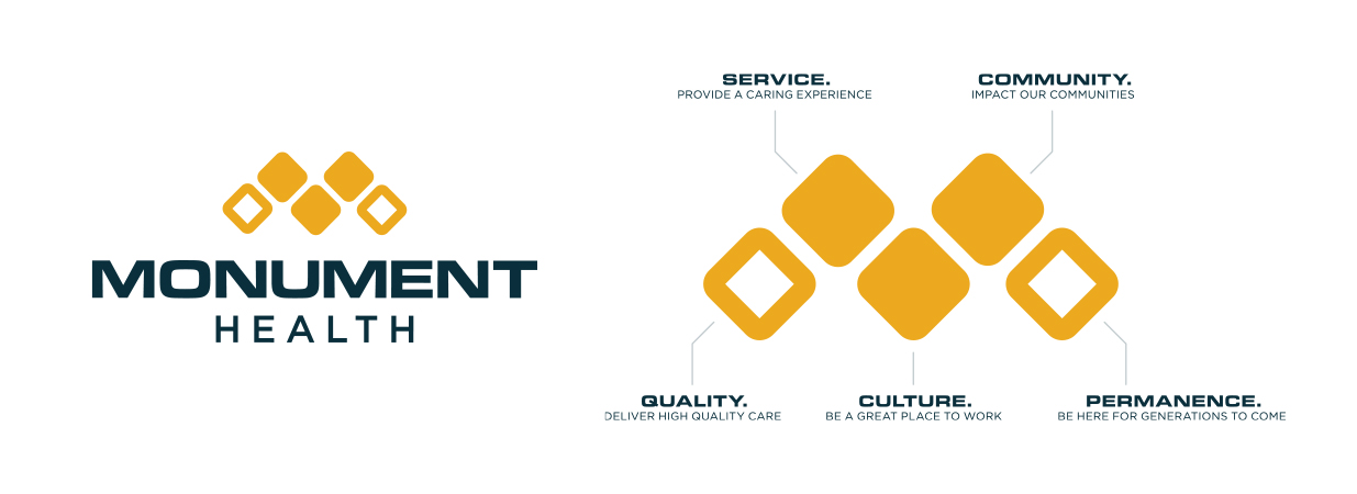
With Monument Health, we designed a logo to match the health system’s new name that featured diamonds, each representing a different priority for the brand. The logo is strong, steady and modern, aligning with Monument Health’s dedication to permanence and progress.
2. DISTINCTION
A good logo is distinct, ownable and instantly identified at a glance. It stands out and is remembered to leave an impact.
With our own agency rebrand in 2018, we wanted a unique logo that blended the best of L&S history with a modern approach. As a result, we launched a rebrand that helps us stand out from other agencies with a look all its own.
3. CLARITY
Logos need to be noticed at a distance and seen clearly in their simplest, smallest form. From a billboard all the way down to a ballpoint pen. At L&S, we vet logos for clarity, ensuring they’re not only seen but also understood at a glance.
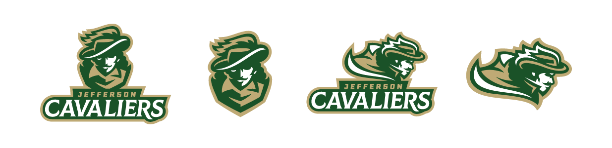
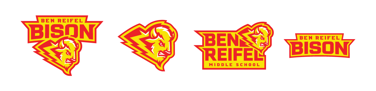
For Sioux Falls’ new high school and middle school, we created a logo package that included several logo versions to ensure clear reproduction in every instance.
4. EXTENDIBILITY
Strong logos have legs. Not literally, but you know what I mean. From marketing campaigns to signage, apparel and even pins, a logo should have an accompanying design system delivered with it, so all marketing and branding efforts are cohesive and derived from that same foundation.
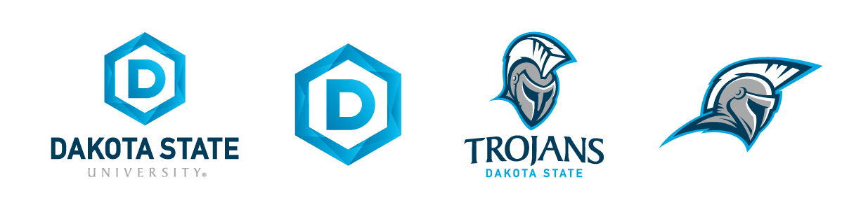
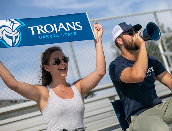
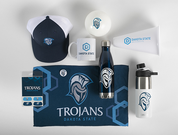
The Dakota State University rebrand was one of our biggest in recent history, and we took special care to ensure the new DSU logo was extendable across admissions campaigns, athletics, campus signage, foundation efforts and more. An extensive brand guide helped communicate the vision behind the logo and gave the client tools for imagery, graphics and more to keep the brand fresh.
5. EFFECTIVENESS
At the end of the day, a great logo isn’t just about design – it’s about results. Does the logo drive the right perception? Does it increase awareness? Does it connect with audiences as intended? At L&S, our designers are uniquely business-minded to consider the results each logo design yields, along with its creativity.
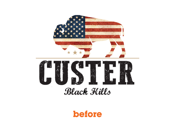
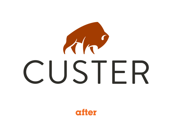
With Custer State Park, a refreshed logo was accompanied by a new website and digital marketing campaign to increase leads by more than 1,500%.
THE PROCESS – AKA SKETCHING AND MORE SKETCHING
So, you’ve seen what makes a good logo. Now, how do you actually make it?
We embark on every logo project by starting with research – competitive, audience, industry, you name it. This research is focused into a strategy brief with client collaboration and approval. After the brief is approved, we work with the client’s dedicated team and a larger expanded creative team to explore concepts, sketches and notes. From there, we develop concepts and vet them before landing on a final recommendation.
Here’s the whole process in roughly 35-ish steps:
- Research/consumer insights
- Strategic brief and kick-off
- Find inspiration (we love Instagram and Dribbble for idea starters)
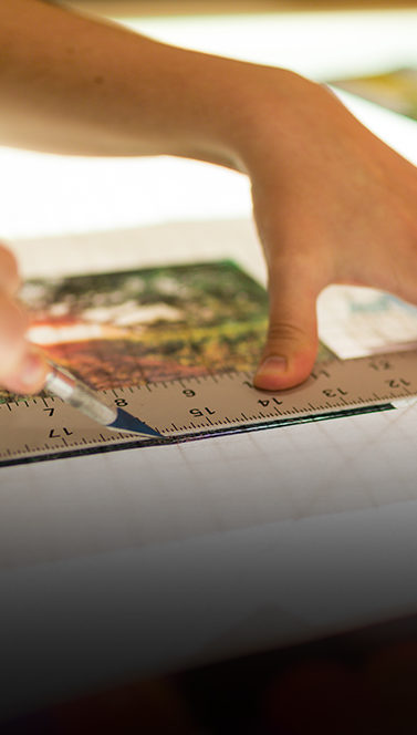
- Sketching – it’s important to put pen to paper before hitting the computer
- More sketching
- Incubation – because sometimes you just need a break
- More sketching and inspiration
- First drafts
- Internal review
- Kill some stuff/process of elimination
- Second draft
- Vetting concepts and legal review
- More revisions
- Present concepts to client
- Revisions (and sometimes more sketching)
- Final concepts
- Color palette (we start logos in black and white first)
- Presentation
- Revisions
- Last logo standing is revealed
- Final legal vetting
- Additional assets developed (patterns, type treatment, etc.)
- Brand guide
- File creation and hand-off
- Rollout campaign
No one can deny that a strong logo is important to your brand. If you’re giving your logo a second look, it’s good to ponder on why you’re considering a rebrand and talk to some experts about the next step to take. We’d love to hear from you. And who knows – maybe your next logo will be designed by me.