Our site uses cookies to customize your experience and help us analyze each crumb of web data.
LEARN MORE


Out with the Old, in with a New Brand
By Kristy Laue
- 05.15.18
- 4 Min Read
At Lawrence & Schiller, we’re creative problem solvers, tackling everything from marketing and branding problems to business and strategy. And sometimes, those branding problems are internal. In the last few years, our agency has evolved. Through initiatives like L&S Next, L&S 2020 and more, we’ve pinpointed opportunities and initiated change in our agency services, vision and approach to campaigns. So it’s only natural that those internal changes would warrant an external facelift. Well folks, it’s finally here.
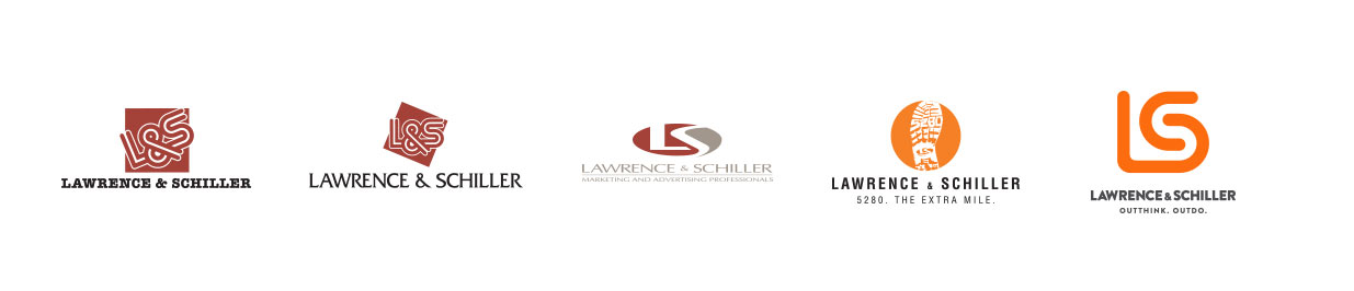
For the last 16 years, the boot has been the symbol of L&S. It’s who we are, and we wear it on our sleeve (literally – just look at the boot pins we wear).
But the boot was never meant to become our actual logo. In its infancy, the boot was developed to represent our internal philosophy: go the Extra Mile (5280) for our clients and do what it takes to get the job done right. This mantra was weaved into everything we did, so eventually we were known for it.
Though we understood the meaning of the boot internally, others weren’t as sure. It proved to be a good conversation starter, but we were confused with being a shoe store (seriously!) or having Mr. Peanut as our logo (just squint and you can see it). Change was needed.
In just the past year or so, L&S has experienced a deliberate shift – agency growth into new markets, new innovations, new initiatives – and was in need of a refresh. There are good times to rebrand, and those are periods of change. So here we are, over a year later, wearing our new logo with pride.
Don’t let the shiny new outside fool you; we still have the same innovative, 5280 spirit inside. Our colors, basic principles and values as a company remain the same. We’re still going the Extra Mile, and this slogan will continue to drive our internal culture. But externally, our new brand promise is to Outthink and Outdo. We help our clients outperform, outshine, stand out– and ultimately drive outstanding results for clients so they can outpace the competition. (Can you tell we have fun thinking up “out” words?)
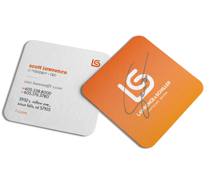
Our goal was to move back to a simpler logo and brand. The new logo actually harkens back to one of our retro logos but with a new spin. It’s clean and versatile with new elements at play, the lines themselves leading to fun animations. These lines embody the forward-thinking, progressive spirit of the agency, full of momentum and always charging ahead.
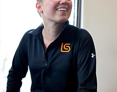
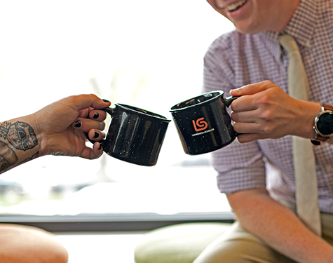
Several new elements are incorporated into our brand. We played with gradients, new photography, a new font family and more. Additionally, we made it a point to incorporate personal elements to show each employee individually is Outthinking & Outdoing for our clients. Handwritten signatures appear on each business card and employee bio, and GIFs fill up our website, showcasing what makes L&S successful: the people.
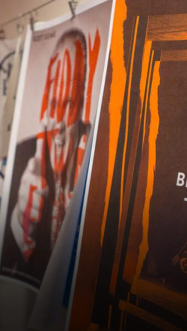
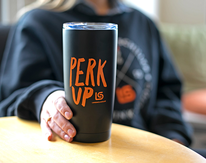
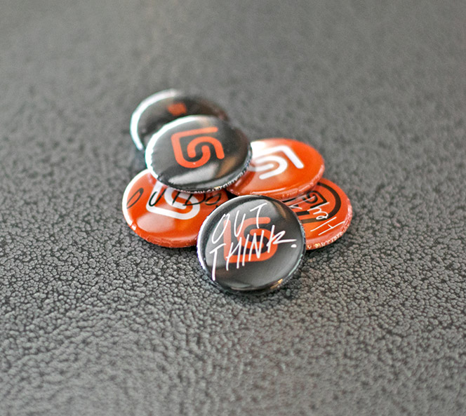
With a rebrand comes fun new merch, promotional pieces, signage and more. Our designers worked hard to incorporate elements of our core look and feel with new branding – and they killed it. Each item, from pens to buttons to hoodies, has a personal touch balanced with a spirit of fun and determination. And did we mention our spiffy new website?
This is an exciting time for L&S. We have hit the reset button and are more motivated than ever to produce outstanding work for our clients. It’s clear each employee is all in on this brand reboot and excited for the future for L&S. Join us on our journey.