Our site uses cookies to customize your experience and help us analyze each crumb of web data.
LEARN MORE


SDCAT: Making Crash Analysis Cool
By Roberta Forman
- 03.29.19
- 3 Min Read
A lot of information is available to the public—for example, crash data from the South Dakota Office of Highway Safety (SDOHS). But just because something is available doesn’t mean it’s accessible. Big difference. Because let’s be honest, staring at spreadsheets upon spreadsheets and 57 pages of pictureless black text can be overwhelming (and boring). So how do you take something like that and turn it into something useful (and visually appealing) for the general public?
Enter the South Dakota Crash Analysis Tool (SDCAT).
SDCAT is the result of multiple SD Department of Public Safety (SDDPS) agencies teaming up with L&S to create something useful and unique. It takes all the important crash data from the SDOHS’s yearly traffic crash summary and turns it into a live infographic that anyone with an internet connection can find.
You might be thinking, “What’s so cool about a crash report infographic?” Well buckle your seat belt (sorry, had to) and let me tell you.
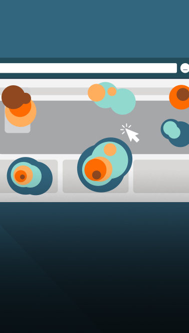
Our challenge was to combine data, digital and design to make a seamless user experience. Instead of creating a large, static infographic, SDCAT animates graphs of data as you scroll down the page using javascript from a data visualization library. The reveal-as-you-scroll strategy allows the page to display several large visuals without bogging down load times. With 16 categories of data to load, that’s super important.
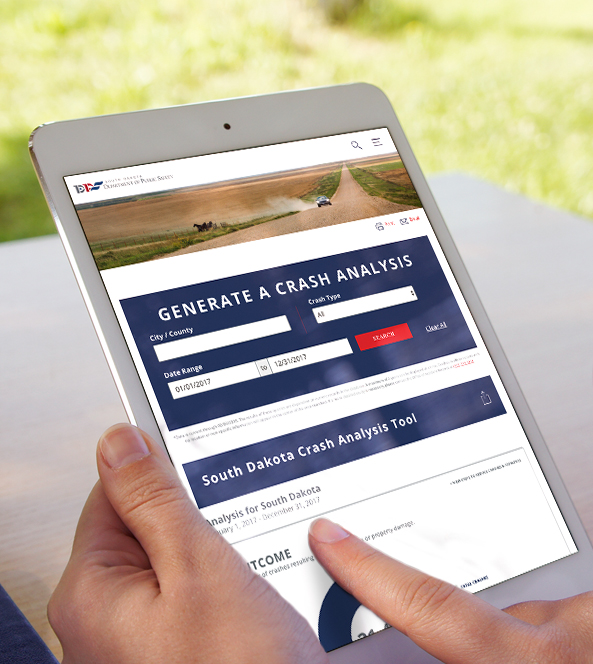
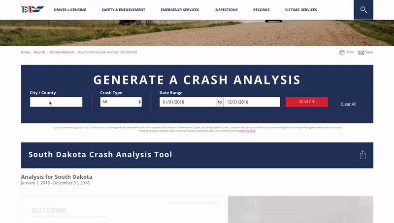
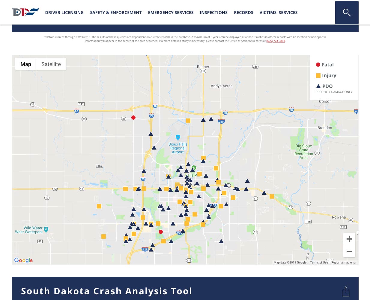
At the top of the page, you can search the entire state of South Dakota or get more specific and search by city/county. You can also narrow down your search by crash type (alcohol, motorcycle, vehicle type) and date range. SDCAT’s data goes back to 2014 and is updated weekly.
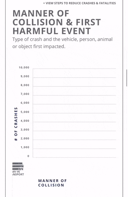
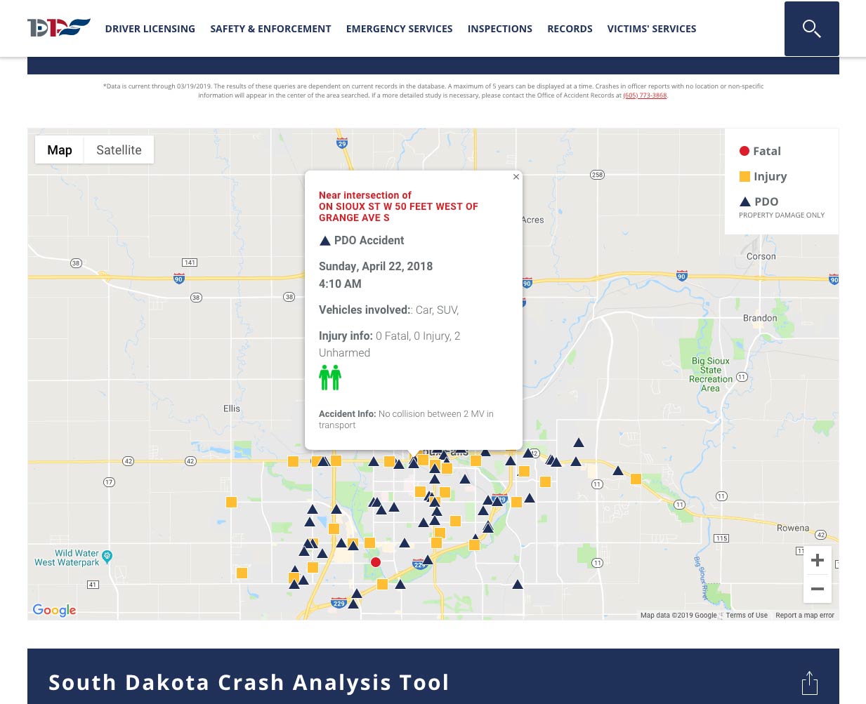
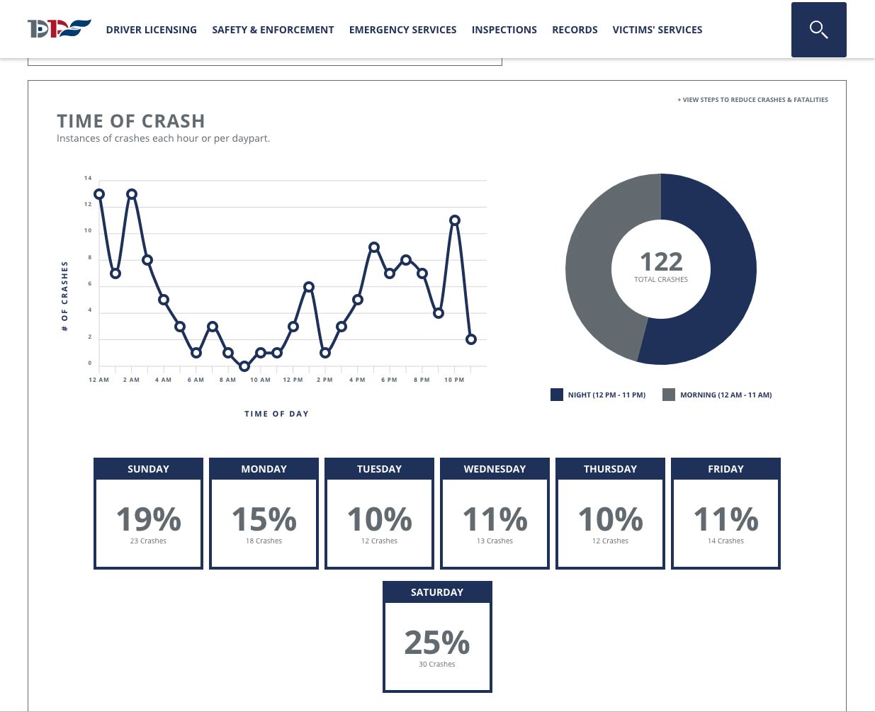
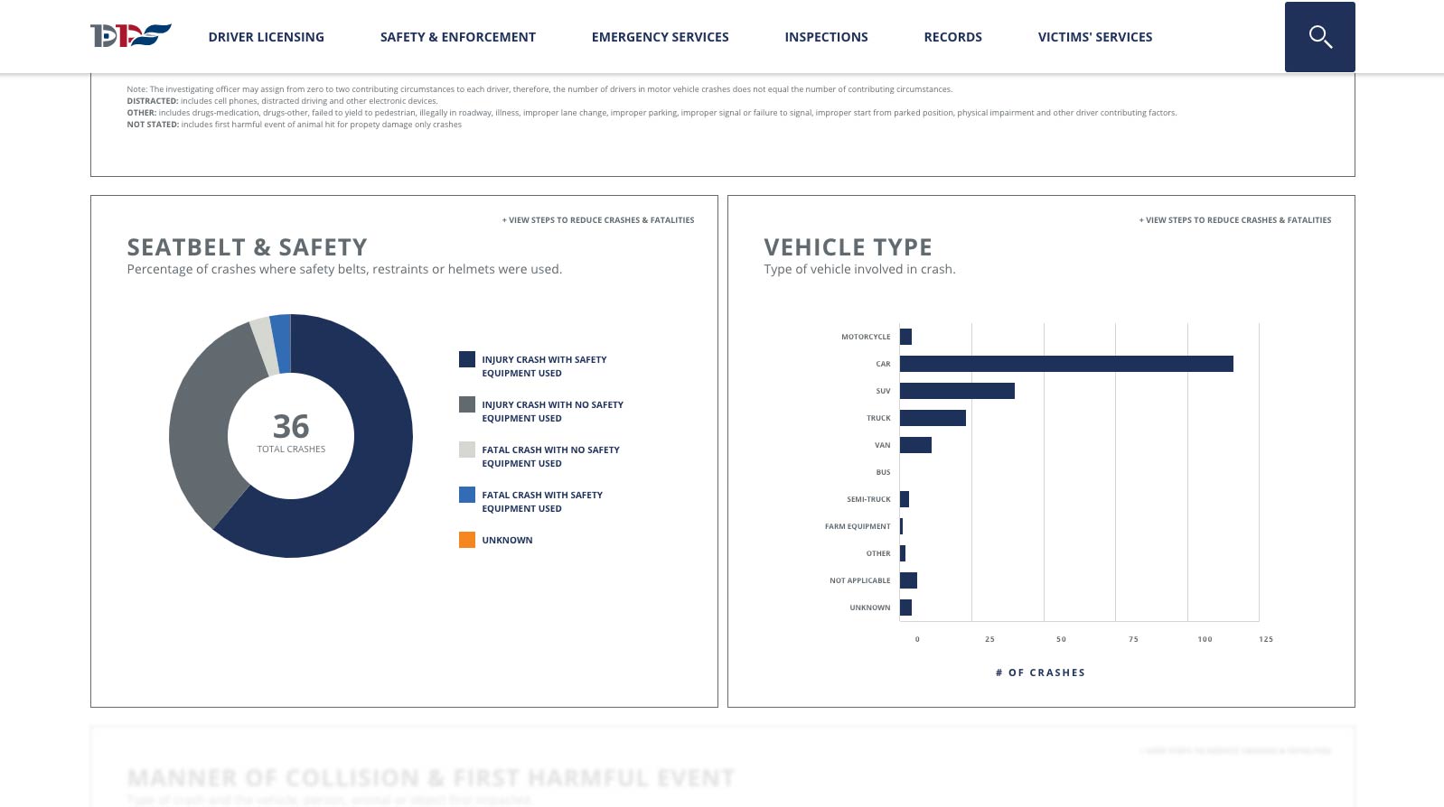
Once you hit search, the site brings up a map where you can click on individual crashes to see in-depth details like the number of people in the car, date and time. If you don’t input a city/county, the information will load for the entire state of South Dakota and no map will appear. As you scroll, you get more information about your selected location and time frame. SDCAT displays pieces of data such as seat belt usage, type of vehicle and surface conditions.
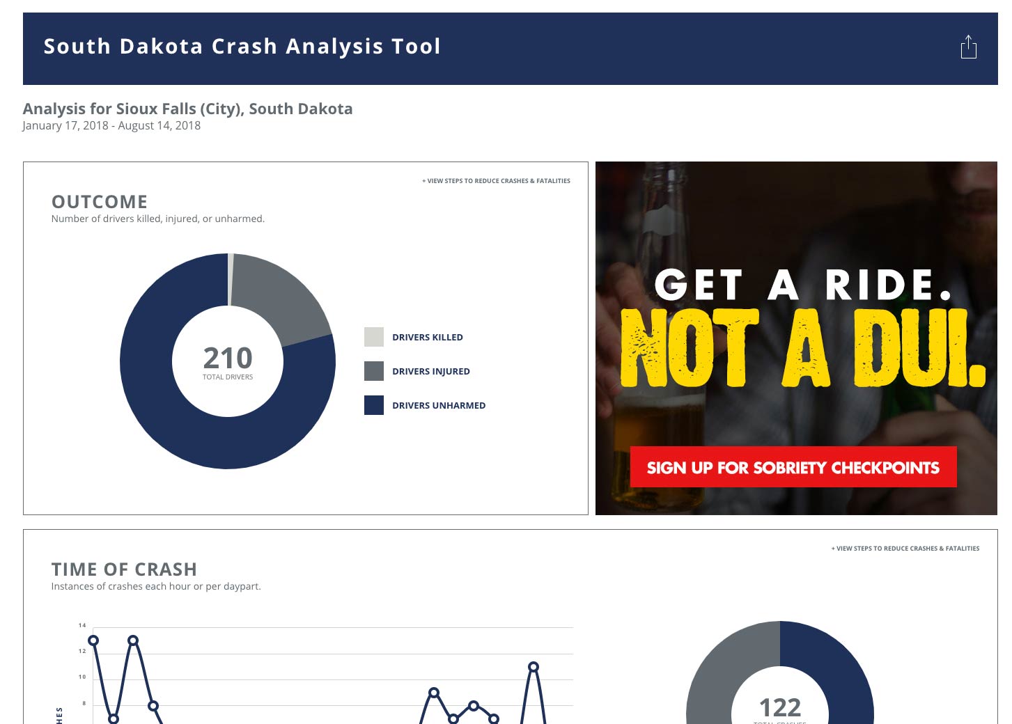
And we didn’t skimp on the safe driving messages. We used the new design as an opportunity to mix in safety messaging like banners reminding you to buckle up, put the phone down and plan a designated driver throughout the page to encourage users to keep their names off the crash database. Each category contains a link to SDDPS countermeasures for reducing crashes and fatalities.
The report SDCAT generates can be easily printed, sent via email or shared on social. And if you’re actually into 57-page no-picture documents, you can download the full Motor Vehicle Traffic Crash Summary from the previous year once it’s available. Tools like SDCAT make it possible for someone to easily pull reports to make a case for a new stop sign or traffic light without spending hours poring over papers. It can also be a great tool for safe-driving advocacy groups like MADD or SADD to see information at a quick glance.
While the design and data are great, we’re most excited about the ability to help the general public get the information they need in a way that’s easy to understand. And we weren’t the only ones excited. In 2018, the SDCAT was the first ever to receive a Silver W3 Award in the Website Features-Data Visualization for Websites category.
Check out SDCAT for yourself and always, always drive safe (SD…dot com…).