driving 5% enrollment growth
Dakota State University
Dakota State University (DSU) is a nationally recognized, technology-fueled college with specializations in programming, cyber security and more careers designed for an evolving world. The university works with the National Security Agency and other organizations to place graduates and nurture partnerships for future security needs.
- Team Synergy
- Team STEVE
- ADDY Award: Gold, Cross Platform Campaign
- ADDY Award: Gold, Sales & Marketing
- ADDY Award: Silver, Elements of Advertising
- Educational Advertising Award: Silver, Poster
- Educational Advertising Award: Silver, Video
- Educational Advertising Award: Silver, Campaign
- Educational Advertising Award: Merit, Viewbook
The problem? DSU needed a brand better aligned with its goals for growth while staying true to its heritage. With the mission of being a comprehensive, innovative university set on a world-changing trajectory, it was more important than ever for DSU to have a strong, cohesive brand identity. Challenge accepted.
DSU needed a brand aligned with its goals for growth.


an insights-driven identity
Just like a college student looking to ace midterms, our first step was to do our homework. Our Consumer Insights team launched a comprehensive research study to better understand the perceptions of the university, meeting with students, faculty, staff, athletic directors and alumni to learn more about DSU’s perceptions and identity.
After collecting feedback, we created four distinct logo directions that could guide the new brand. We shared them with hundreds of individuals through online surveys and in-person focus groups to see what worked best and what missed the mark.
We tested concepts with surveys and focus groups to see what worked best.
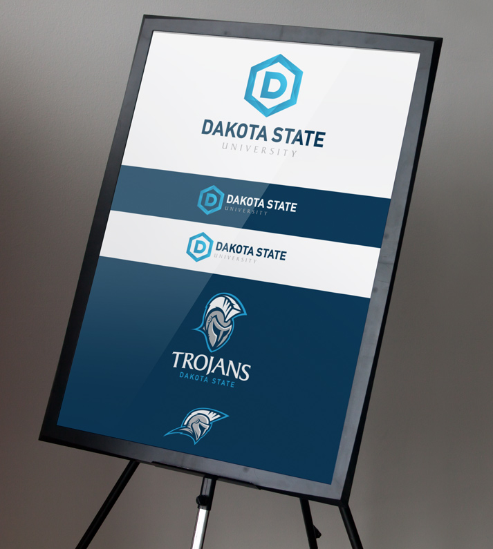
The four logos were pared down to two, and the final look ended up being a new derivation from our focus group feedback. Sometimes focus groups don’t just help you pick the right logos – they help you eliminate the wrong ones.
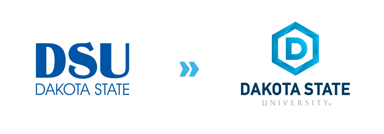
Ultimately, we settled on a direction that positioned DSU as a university designed for the future with geometric influences, a sleek color palette and new brand messaging. It would allow DSU to finally unite under a shared and unified brand, while communicating both a sense of belonging for students and a feeling of empowerment for stakeholders.
breaking down the new brand

the hexagon: one of nature’s strongest shapes
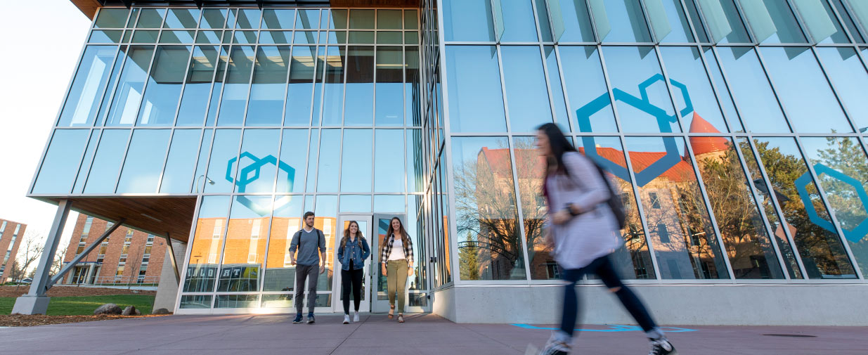
There’s a reason why bees work in honeycombs. The hexagon is organically one of the universe’s strongest shapes for building, growth, strength and expansion. And at DSU, the hexagon pops up in architecture, campus materials and even curriculum with the MadLabs program.

trojans: a culture of innovation
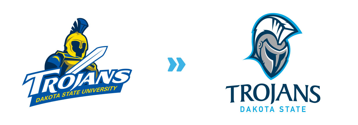
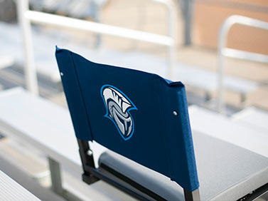
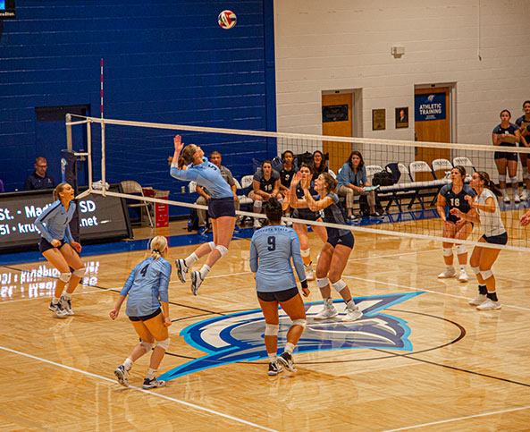
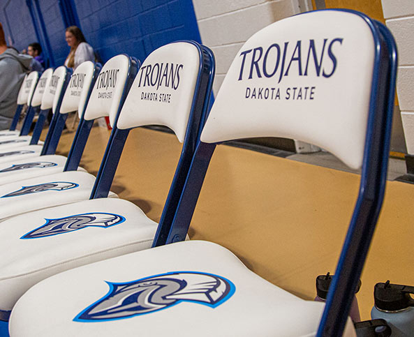
Trojans were known for their innovation, forward-thinking technology and prosperity. For DSU’s athletic brand, an updated Trojan logo meant a fierce approach that combined victory and innovation.

color palette: designed to make dsu shine
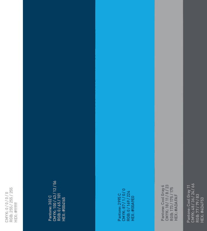
Gold was stripped out of the color palette, with lighter and darker shades of blue added to help DSU stand out from its competition and show how the many facets and shades of DSU are united together under the new brand.
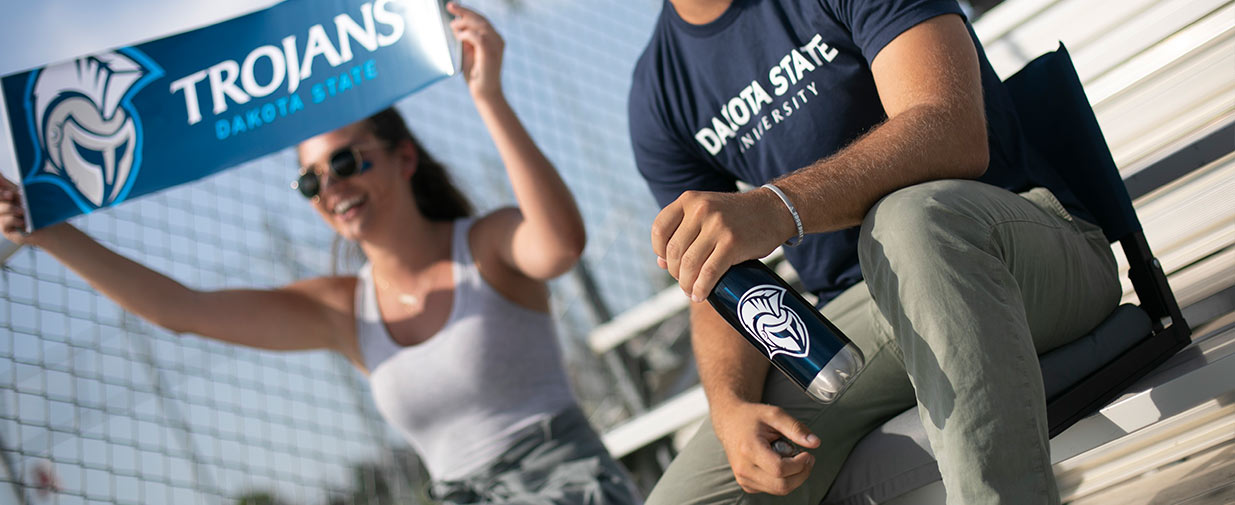
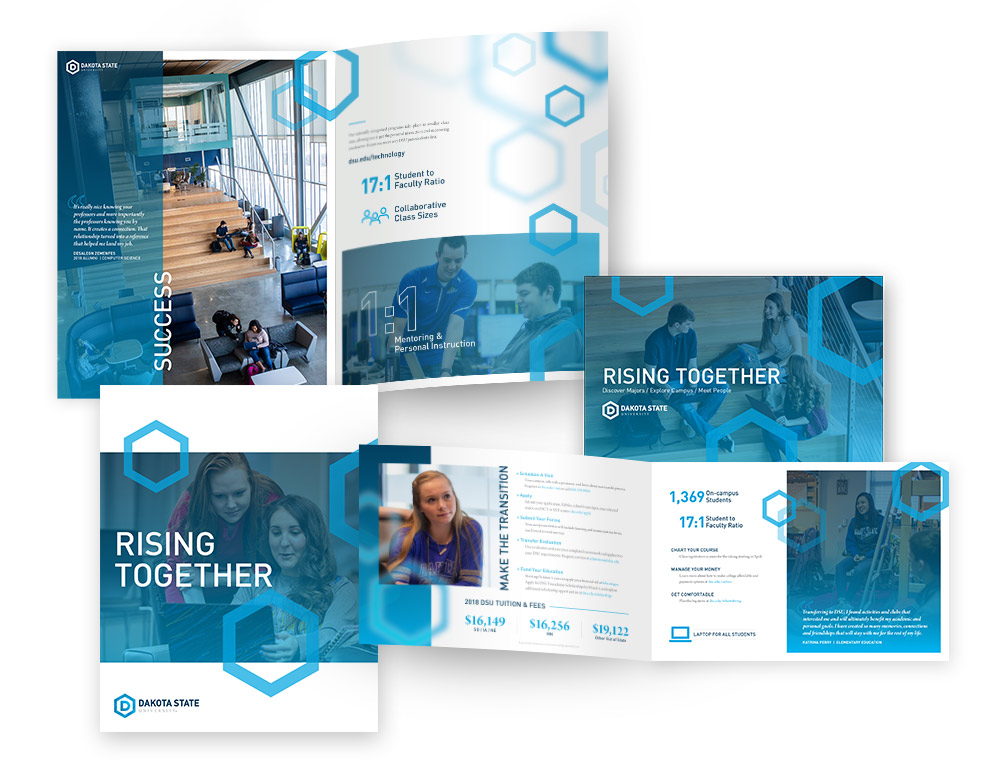
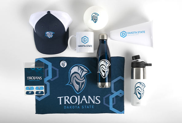
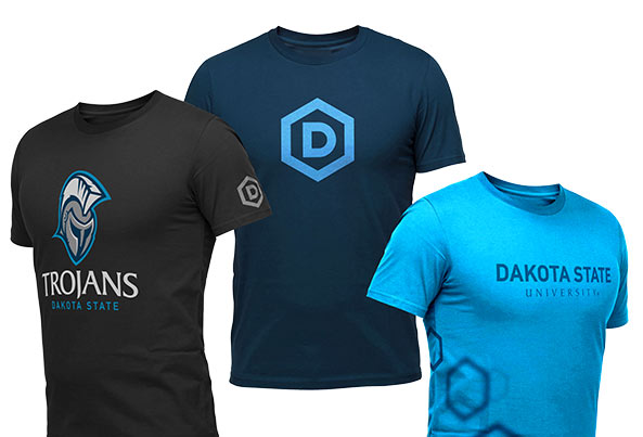
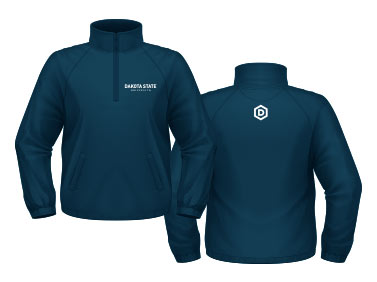
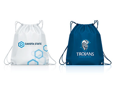
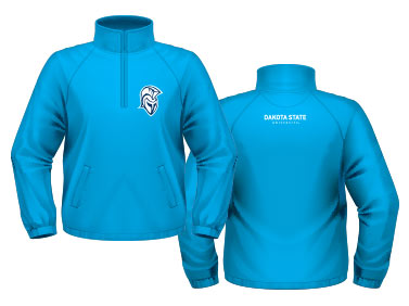
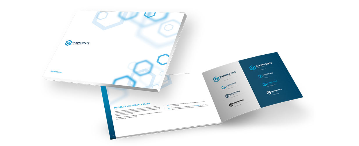
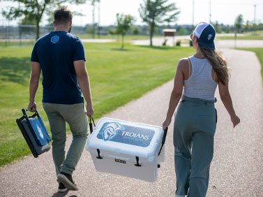
The final brand identity package included new university and athletic logos, a detailed brand guide, photography, a complete athletics package and more. With all elements combined, this new position is about more than a logo. It’s a new way of thinking about education reflective of DSU’s progressive ways of teaching.
success redefined
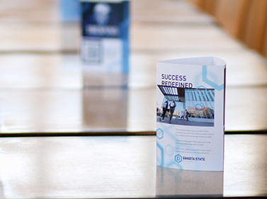
After more than a year of research, creative development, and focus group testing, the Dakota State University rebrand launched to great acclaim at a year-end event for faculty and staff. The brand was introduced to students to kick off the 2019-2020 school year.

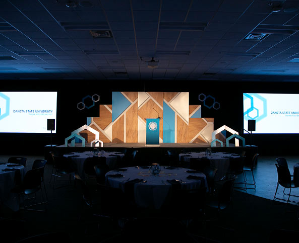
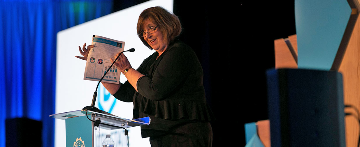
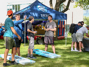
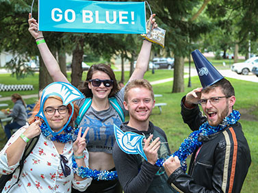
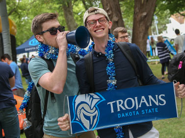
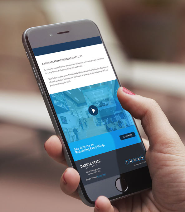
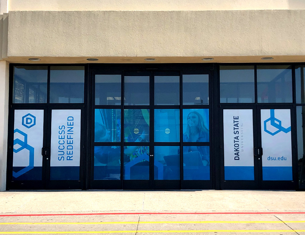
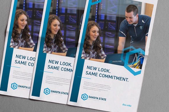
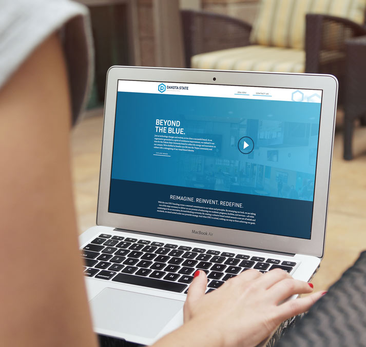
The formal launch of the new brand was supported with a full rollout campaign celebrating “Success Redefined.” It’s a redefinition of who DSU is, along with a redefinition of what a university education means in a modern era. New ways of teaching, learning, hands-on training and new opportunities are all reflected in the messaging. The campaign included billboards and out-of-home elements like mall advertising, as well as digital units, video, emails, and social media posts to help bring awareness to the new brand and to DSU’s mission.
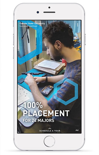
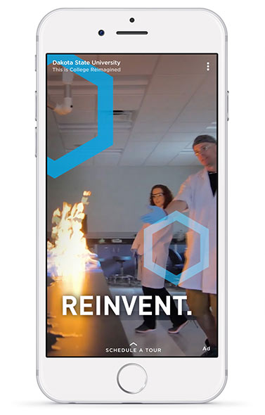
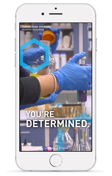
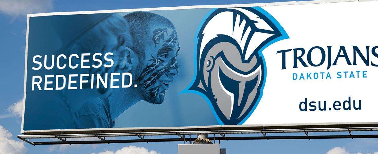
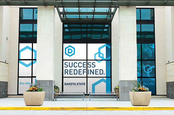
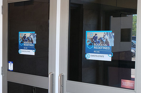
l&s helped dsu see its largest freshman class ever in 2019.
After the 2019 rebrand, L&S helped DSU see its largest freshman class ever with a 5% enrollment increase. In addition, DSU saw a 16% increase in graduate student headcount and a 14% increase in full-time equivalent graduate students. We earned 32 million brand launch campaign impressions, setting the foundation for a successful schoolyear. In 2021, DSU’s headcount increased 1% and graduate students were up 5%. All while enrollment at the state’s five other public universities remained flat or decreased, and SDBOR schools systemwide were down .35%.
With the rebrand now in place, DSU is on pace to see even greater success, leveraging a collegiate brand built for today that’s guaranteed to last long into the future.


