Our site uses cookies to customize your experience and help us analyze each crumb of web data.
LEARN MORE


Brighter, Better, Faster, Smarter
By Travis Adney & Mariah Hanten
- 05.11.18
- 10 Min Read
If you’re a frequent visitor to the L&S website, you’ll see that we’ve made some big changes recently. This redesign did not take part as a result of the typically recommended three-to five-year revamp, but from looking at L&S as a whole and, as a result, creating a website to reflect where L&S was headed – a brighter, better, faster, smarter future (cue the Daft Punk).
In creating the design, we took a totally new, mobile-first approach to generate a website that appropriately represented our agency, its people and the work we do. Check out the bright new visuals with a rad gradient and some much-needed white space (Roberta can finally breathe now). Sprinkle touches of personalization, intelligent notifications and the most flexible blocks that we could find and there you have it – a new era for Lawrence & Schiller.
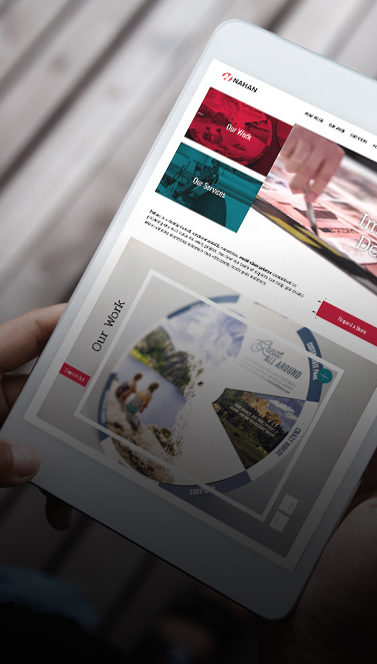
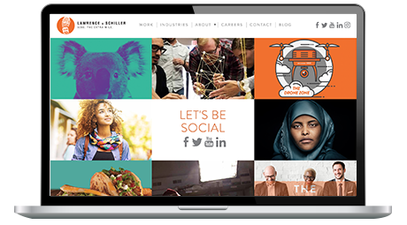
Hello, Homepage
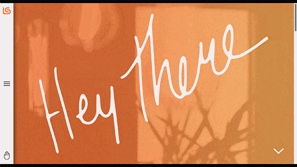
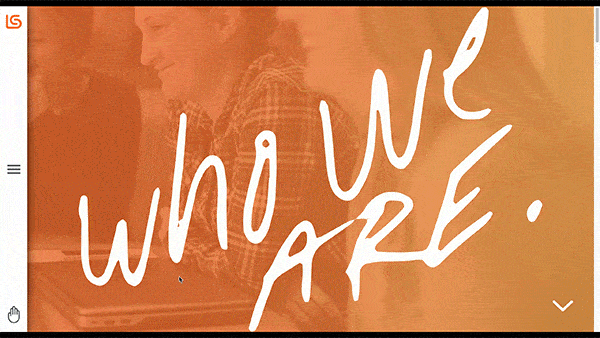
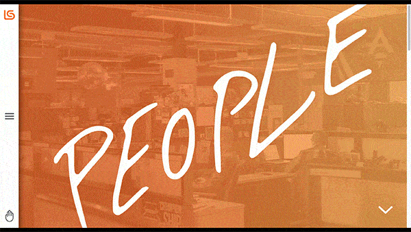
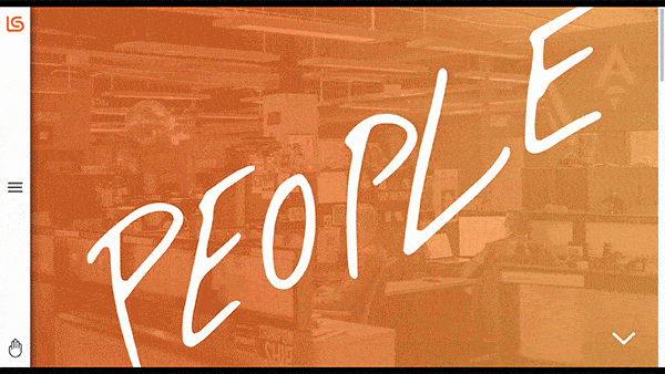
It really does feel like home, doesn’t it? We had too much fun producing sizzle videos, candid shots of our most colorful peeps and best of all – the best of category work – all displayed at the top of each page. Not only do we have all new perspectives of the agency, but each hero section has two overlays – our new colored gradient and titles scribed by one of our very own employees (can you guess who?).
Nothin’ hits home like quotes from our fearless leader, Scott Lawrence, and real results from the work we do. If you keep browsing, you’ll find numerous quote blocks that truly speak to who we are and how we do things around here.
Finally, we needed to put our best foot forward with some of our most recent, award-winning work. Don’t blink, because we’re true believers in quality over quantity and our best work will change about as often as Travis‘ hairstyle (put away the bleach).
Navigation: A Mobile Mentality
Ahhhh the sacred navigation. We said “to heck with your typical dropdown” – let’s treat the new site like a giant smartphone. So we did just that, pulling in some of the best elements from our beloved iPhones, Pixels and Galaxies. Badge notifications, hamburger menus and icon-based interactions transformed the L&S site into a familiar mobile experience – no matter the device.
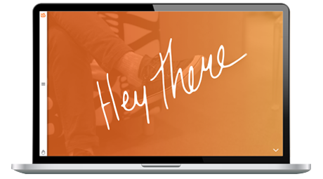
The Hand
We have a feeling that the cryptic hand will raise a few questions for users. Rest assured, the hand is one of the most useful tools on the new site because we made it all about YOU! At any point in your journey on the L&S site, you will have the ability to easily get in touch with us – we call it our dynamic contact screen. We hear your internal thoughts – “why the hand, L&S?”. SPOILER ALERT: it doesn’t represent Mariah‘s famous party girl expression.
- Hands are for waving – we love when you reach out to ask us about any and everything. Send a note!
- Hands are for handshakes – we want to help you with not only your marketing/advertising problems, but also your business problems. We want to work with you so you can take it to the next level.
- Hands are for raising and to call attention to yourself – we’re always on the lookout for the best peeps in the industry and that could be you. Join our team.
- Hands are for grabbing things – like the latest industry knowledge, research and insights. We’ve got a lot of brain power here at L&S and love to share it with you.
This time it's personal
We couldn’t do what we do without our hardworking, spunky team of L&Sers, which is why we took the time to integrate personalized bits throughout the site to reflect how much we value our people. A personal favorite are the GIFs displayed on our people page. Creating these animations was a fun way to let the personalities of each individual shine through. Pair this with the handwritten signatures, and each employee was able to, very literally, touch the site in some way.
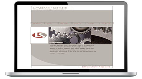
timewarp!
We’ve had a ton of fun evolving with the web over the years. And while each of our websites improved year after year, it’s fun to take a step back and pay homage to our digital home with each redesign. If we can’t look back and laugh at ourselves for some retro designs, we’re taking things a little too seriously around here. Enjoy!
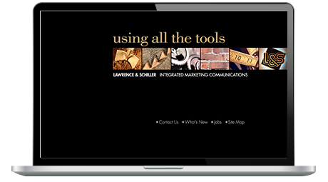
1999
2001
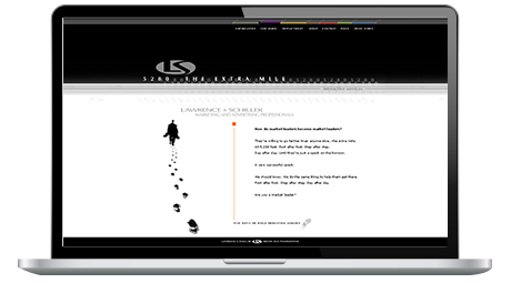
2003
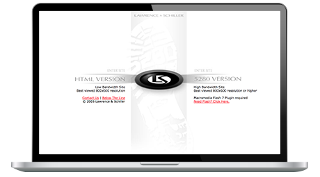
2005
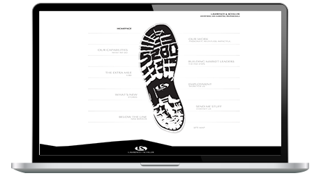
2007
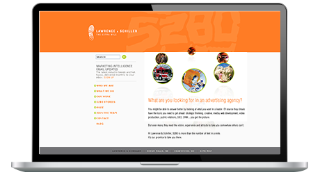
2008
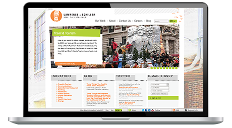
2010
2015
2018