How to Create Killer Visual Ads
- 07.19.21
- 4 Min Read
Ever since social media networks became a part of our everyday lives, marketing has been all about seizing the opportunity for advertisement.
Investing in a good social media strategy benefits your brand in several ways. It builds trust among your audience, generates new leads, and introduces two-way communication between you and your followers. Aside from having a potential for high ROI, social media ads done right can overmatch all your expectations. But to be done right, they have to be visually appealing. Your audience sees countless ads a day, so yours have to stand out. Here’s how.
WHY IS AD DESIGN SO IMPORTANT?
Social media ads have a high potential to boost your business growth. In order to get the most out of this opportunity, you need to launch ads that will generate conversions.
Why is it so important what an ad looks like?
Communities on social networks are overwhelmed with the number of ads they’re exposed to daily. Think about it: you can’t scroll your feed on Instagram without a sponsored post sneaking in between the profiles you follow. A well-designed visual ad has the power to captivate the viewer and inspire interest in your brand. We are visual beings.
Apps like Instagram, TikTok, or Pinterest are incredibly successful solely because we love looking at pictures and videos. If your ad is beautifully designed, the chances of people sharing your ads with their friends grow. This way, you are spontaneously inspiring new ambassadors for your brand.
A good ad design also helps your brand stand out. An ad that’s aligned with your brand’s visual style and vibe helps your brand become more memorable. The second time someone sees your ad, they will recognize it instantly, and stick around a little longer to see what your story is all about.
1. SPEAK FROM YOUR BRAND
Every player on the market knows by now just how important brand consistency is. So, before you begin designing your campaign, start with your brand values and mission.
Your brand identity, visual style, voice—this is a framework for when you launch any marketing campaign. Visual ads should support and spread what your brand is really about. They should also contribute to your brand’s visibility and social media trail.
So, if your brand is serious and professional, a playful campaign unlike you is not an option.


2. CRAFT A POWERFUL MESSAGE
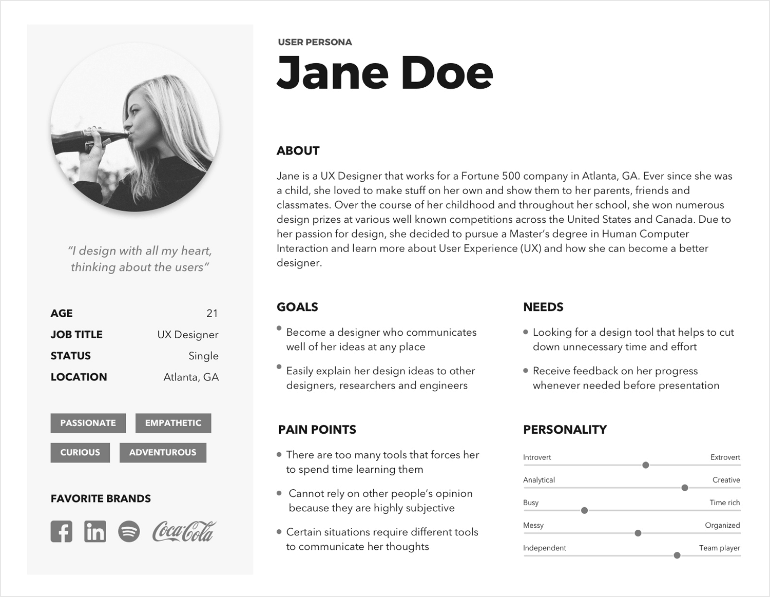
To choose what content to put on your ad, your key reference is your audience or buyer persona. In general, using a persona in content marketing is shown to give better results and saves both money and time in the long run.
From the point of view of your average buyer, design a message that has the power to:
- Grab attention
- Intrigue
- Raise interest
- Bring new information
- Offer unique value
- Inspire curiosity
- Drive conversions

3. INSPIRE AN EMOTIONAL RESPONSE
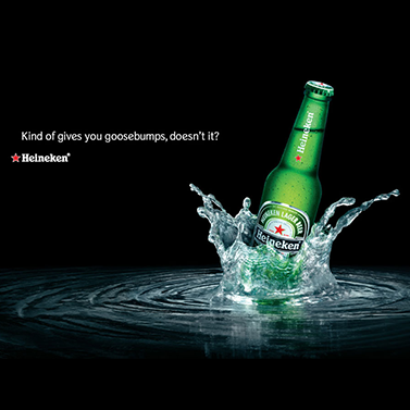
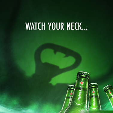
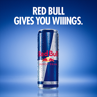
Your message, every word in your story and your visual appearance should not be scrolled past. The best way to lead people to click on your ad is to awake an emotional reaction. Sometimes this means that your ad doesn’t speak about your product at all.
For example, Red Bull rarely ever talks about the drink they produce. Their whole brand revolves around how the drink makes you feel. This same principle is giving astonishing results in Heineken campaigns.
So, what is the story behind the value you are giving to your users?
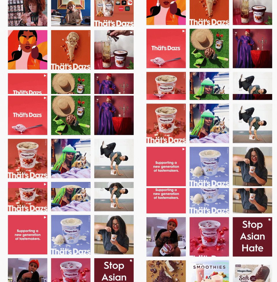
4. CHOOSE INVITING COLORS FROM YOUR PALETTE
Your ad should match your brand’s visual identity. But this doesn’t mean you can’t play around with a sub-palette used for social media ads.
Since the goal of your ads is to generate leads and, ultimately, conversions, your visual design should be tempting and inviting for clicks.

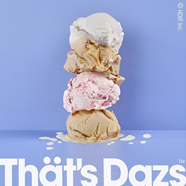


5. MAKE YOUR CTA BUTTON STAND OUT
A call-to-action is the reason behind running an ad in the first place. You are designing a visual graphic and creating a message—all to get people interested to click and to convert. This is why the CTA button needs to be clear and esteemed over your entire ad.
It’s recommended to use strong, vibrant colors for a CTA. Aside from the right color, there are some designer tips on how you can make your button even more noticeable. A border around your CTA button is a small yet powerful design element in your visual ad.
The framing effect is setting your button apart from the rest of the ad, and it sends a clear message to your user: This is the place to click.



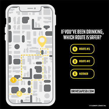
6. ALWAYS CHOOSE SIMPLICITY
The golden rules of design apply to ads, and they target the need of the viewer directly. Simplicity and minimalism are the goals of each design: deliver a message via short, digestable content.
Stuffing your visuals with information will only confuse the viewers who won’t know where to look or why your ad matters to them.


7. THINK OUTSIDE THE BOX
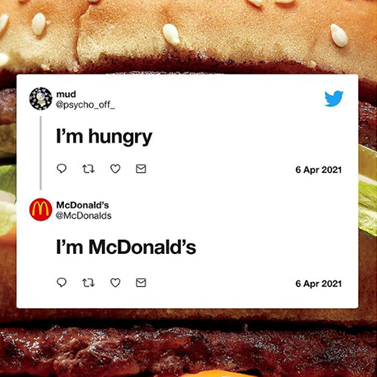
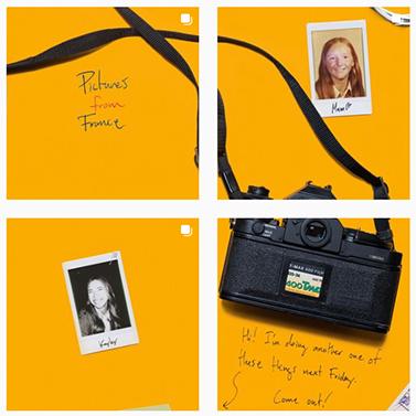
An experimental mindset is important in today’s marketing. Especially in social media advertising. Most brands stick to the familiar grounds when it comes to their campaigns on Facebook, Instagram or YouTube. And they get some results.
However, this is also a chance for your team’s creative side to test new ideas and inspire new trends. Don’t be afraid to launch something new and test a few out-of-the-ordinary ideas. It could be that you don’t get any results. But you can also hit the jackpot.


8. ANIMATE YOUR ADS
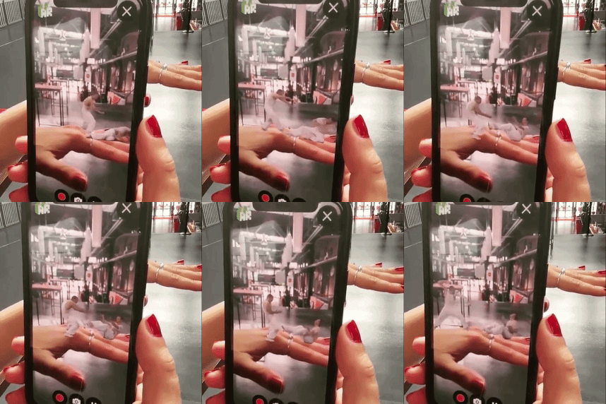
Animated visuals are much more engaging than static ads. Videos, for example, often get better reach on social media than images. This is why Facebook is adapting its algorithm, Instagram now has the “reels” section and TikTok is trending.
Create a video or an animated graphic to invite your audience into your universe.



Tip 9. TEST YOUR ADS
Run a test campaign to measure the results and develop your ads further. If you are uncertain which type of design works better for you, small-scale A/B testing will help you choose. Run a competition between two similar graphics and see how an alteration, no matter how small, can change the results.
When it comes to visual ads, every detail matters. A small change of size or shade of a color can instantly boost your campaign.
Tip 10. ANALYZE AND IMPROVE
Review the results from the test. Measure the differences in impact and KPIs, then improve your design. Repeat the testing and improvement as long as you have to until you reach the full potential of your campaign.
Repeated testing is not as resource-consuming as you might think. It is far less cost-effective to launch a campaign that is not ready and won’t give you optimal results.
Author: Nina Petrov is a content writer, passionate about graphic design, content marketing, and the new generation of green and social businesses. She starts the day scrolling her digest on new digital trends while sipping a cup of coffee with milk and sugar. Her white little bunny tends to reply to your emails when she is on vacation.
Social link: https://www.linkedin.com/in/nina-petrov/


