Our site uses cookies to customize your experience and help us analyze each crumb of web data.
LEARN MORE


websites that are winning
- Tourism
- 02.01.22
- 4 Min Read
THE SCOOP
If you didn’t already know, L&S has super talented employees that make stellar websites. In 2021, our agency took on four new website projects to broaden our portfolio: Black Hills Vacations, Deterra, DeWitt, and Visit Brookings. With each client we worked to identify goals and key strategies to increase online traffic and sales. We wanted to create platforms that were clearly organized, easy to update and that showcased relevant information in a modern, commerce-first way.
Let us take you on a deeper dive into each website and how it’s unique.
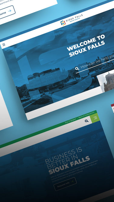
BLACK HILLS VACATIONS
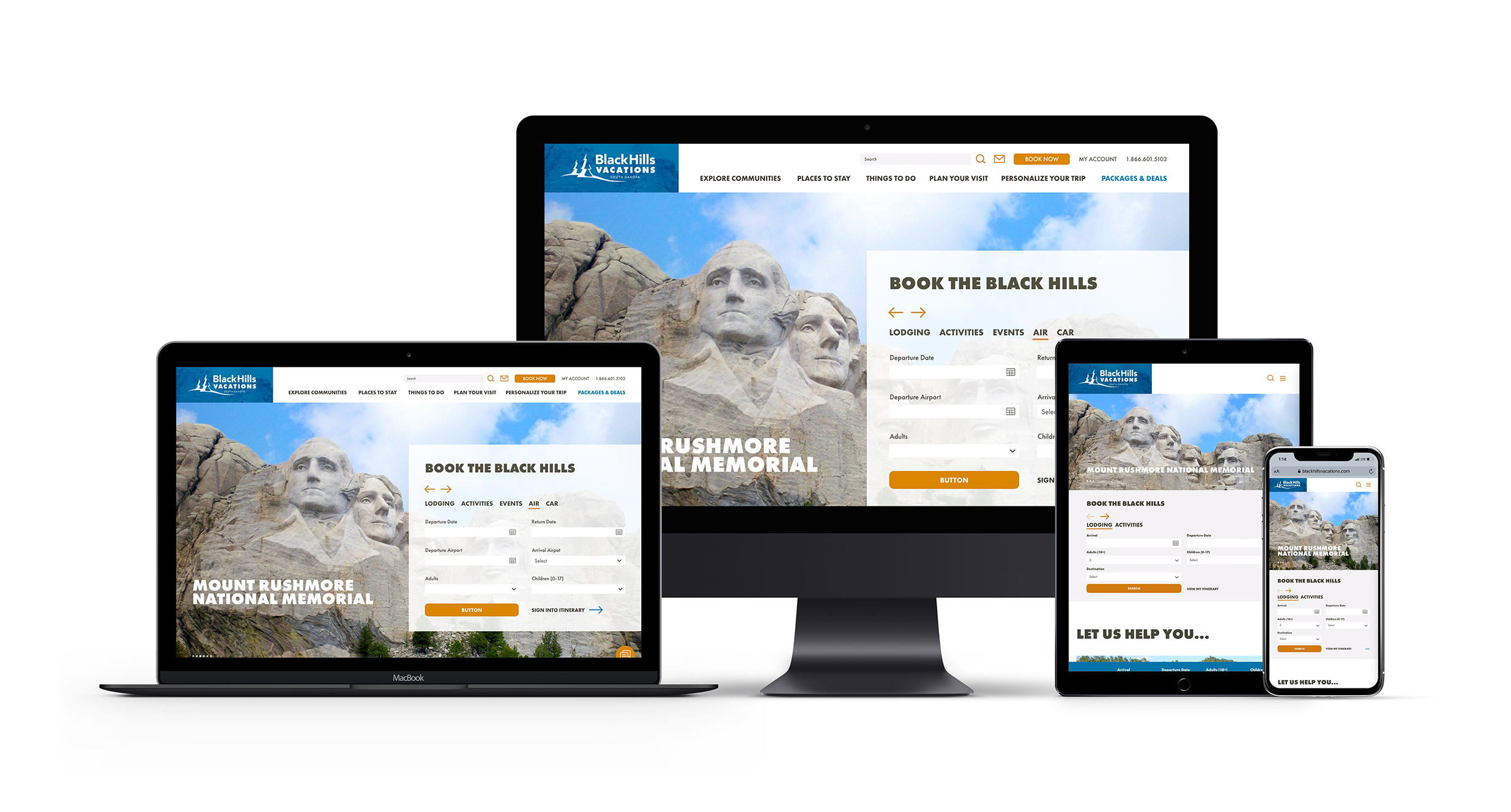
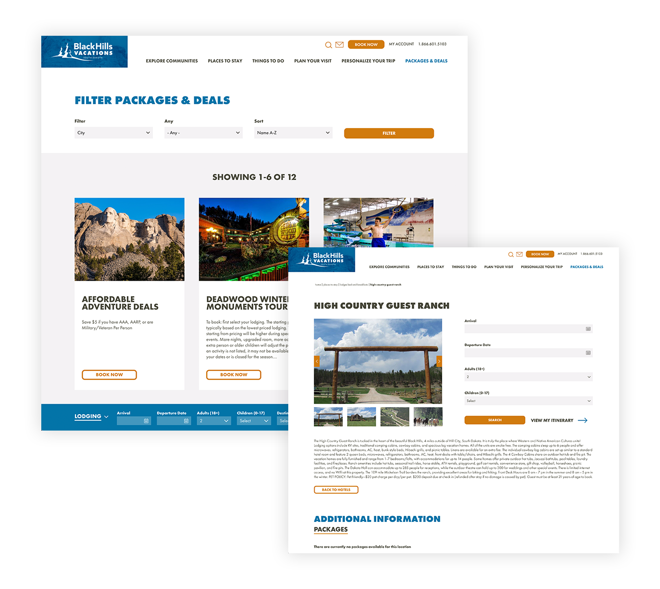
L&S helped blackhillsvacations.com with a website that provided easier access to booking paths and an overall simplified booking experience. The goal of this build was to lessen distractions, and only offer engaging and necessary content. Some of the content we added was a Download or Request a Guide page, a Lodging Intent tool and access to exclusive packages and offers provided by Black Hills Vacations partnerships.
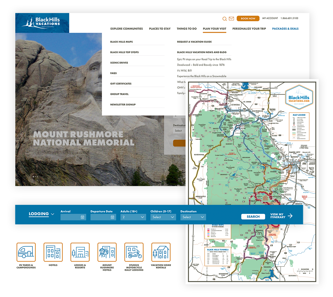
We created lots of neat things in this build including mega menus that interested users, applicable CTAs and imagery to drive interaction, six Black Hills maps to display key areas and fresh website blocks for a flexible platform. And, there was a method to our madness. Not only did our content need to focus on our key audiences for effective strategy development, it needed to be optimized per changes in keyword trends and keyword research. The final leg of the race was finding tools we could incorporate to help the user, which turned out to be Inntopia in one case and a sticky booking widget in another.
DETERRA
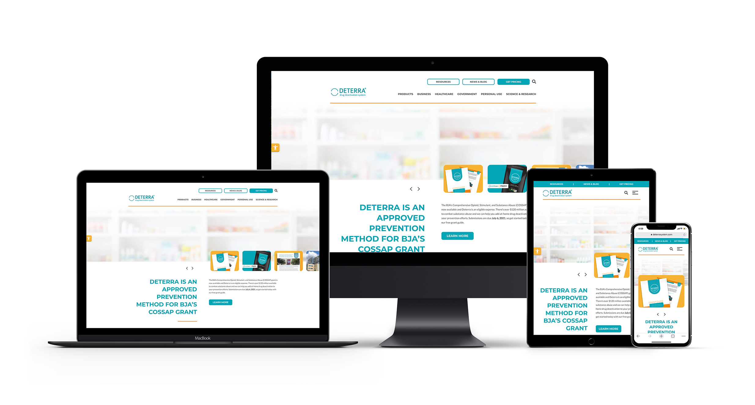
Deterra is an exclusively eCommerce company that sells drug deactivation and disposal systems. The client and L&S decided to completely overhaul the website content structure to better speak to individual audiences. We created a specific message and site page for personal, government, business and healthcare. L&S modernized the design through expanded branding elements like accent colors, iconography and effective use of white space for a light, clean feel. Rounding edges of blocks on the site softened the imagery and bold CTAs drew users’ attention to the right places. The design and user experience were also elevated with the use of videos and subtle animation.
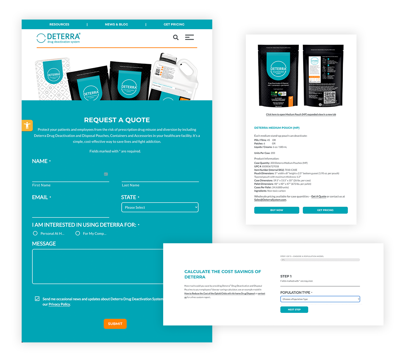
Functionality was next on the list of to-dos. Sophisticated, integrated forms were the heart of this build. The site’s main goal was capturing form submissions, but what is done with these upon submission is the coolest part. Website form integrations with Salesforce and Pardot allow for Deterra to move leads through the sales funnel in a practical and resourceful way. Other tools, such as the Cost Savings Calculator, educate users on Deterra products in real time.
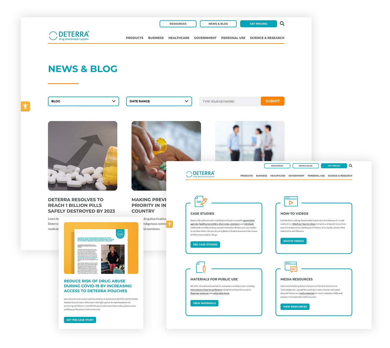
We also decided to add a little L&S pizzaz with revamped blogs, newsroom articles, whitepaper downloads and other resources. This was done to give users the materials they may need to make decisions about purchasing Deterra products in a straightforward way. Finally, critical website accessibility options and toggles give users the ability to view the site to their liking with high contrast, readable fonts and font re-sizing.
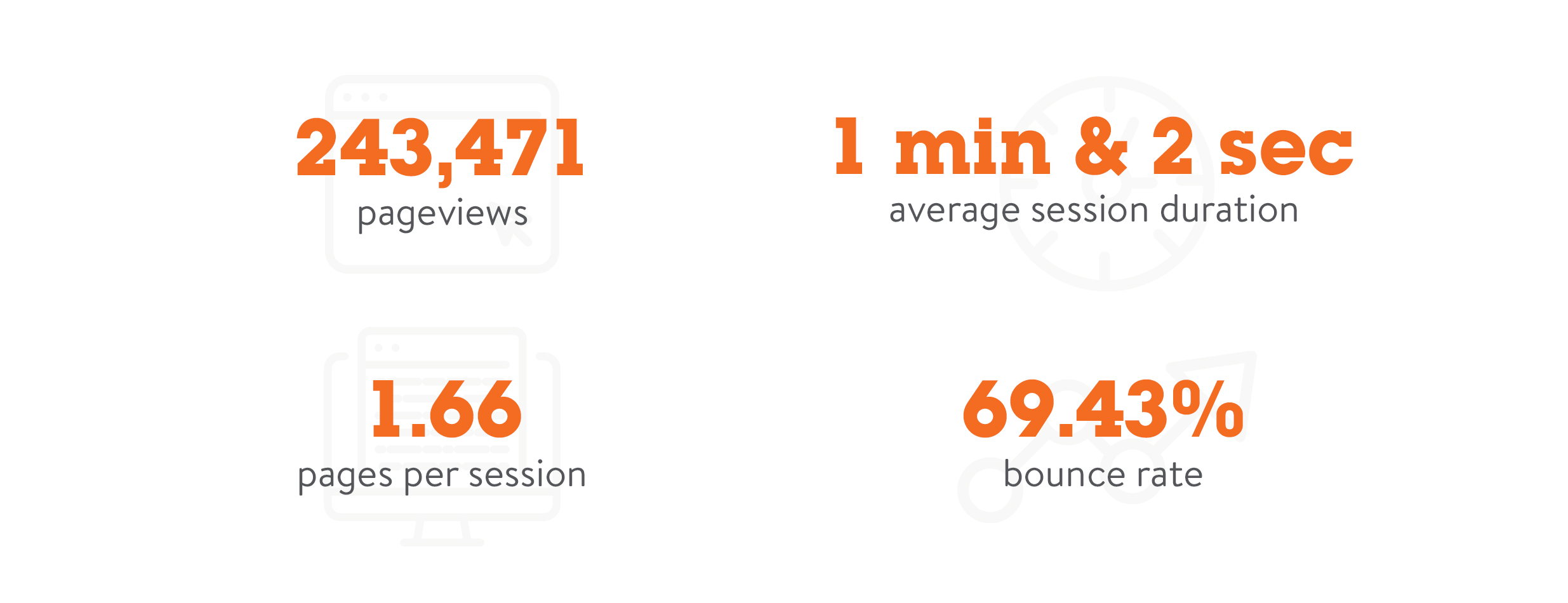
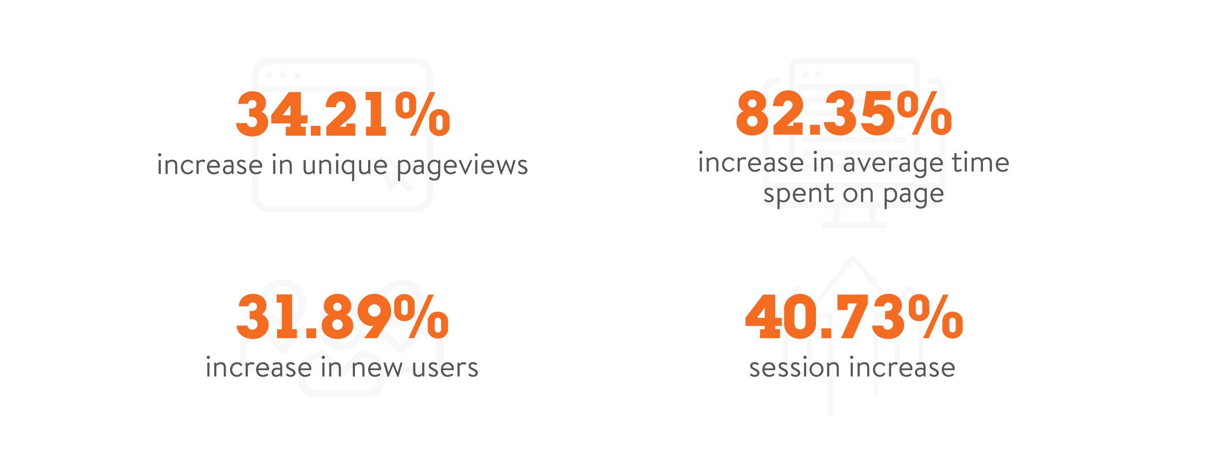
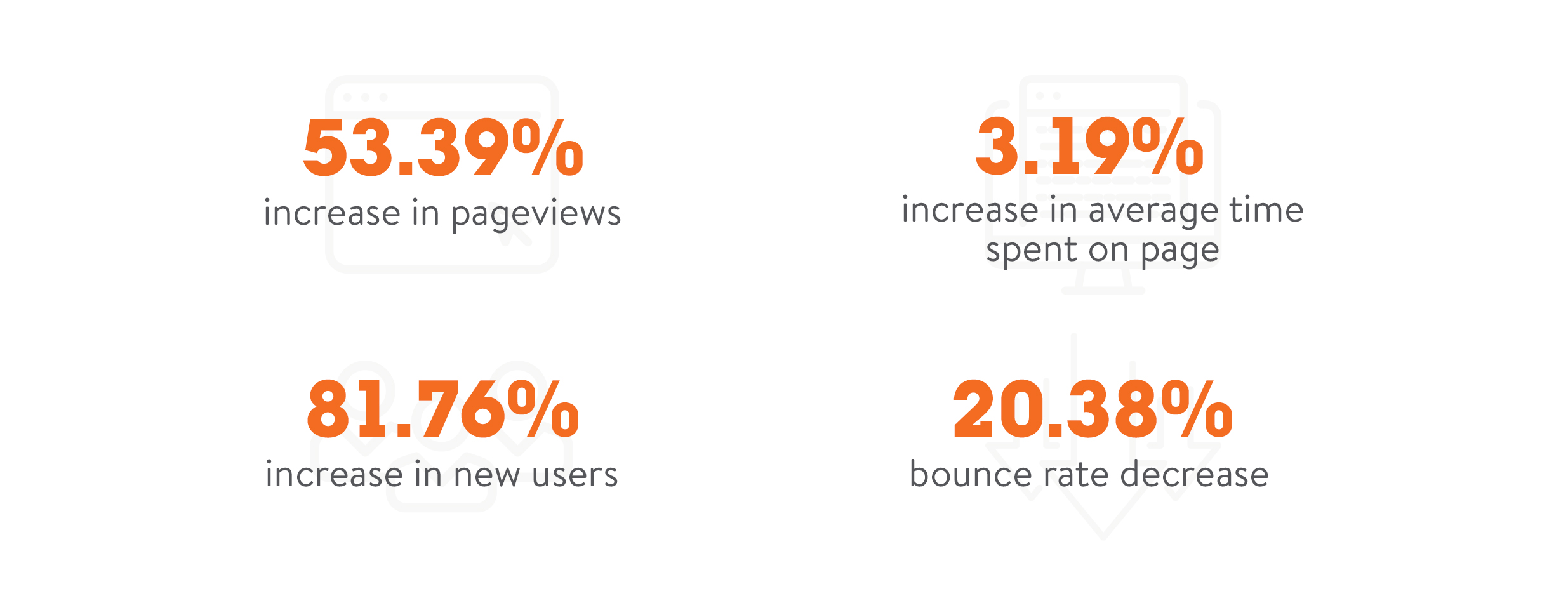
What was the agency’s favorite part? Easy, the results of the website build.
DEWITT DESIGN
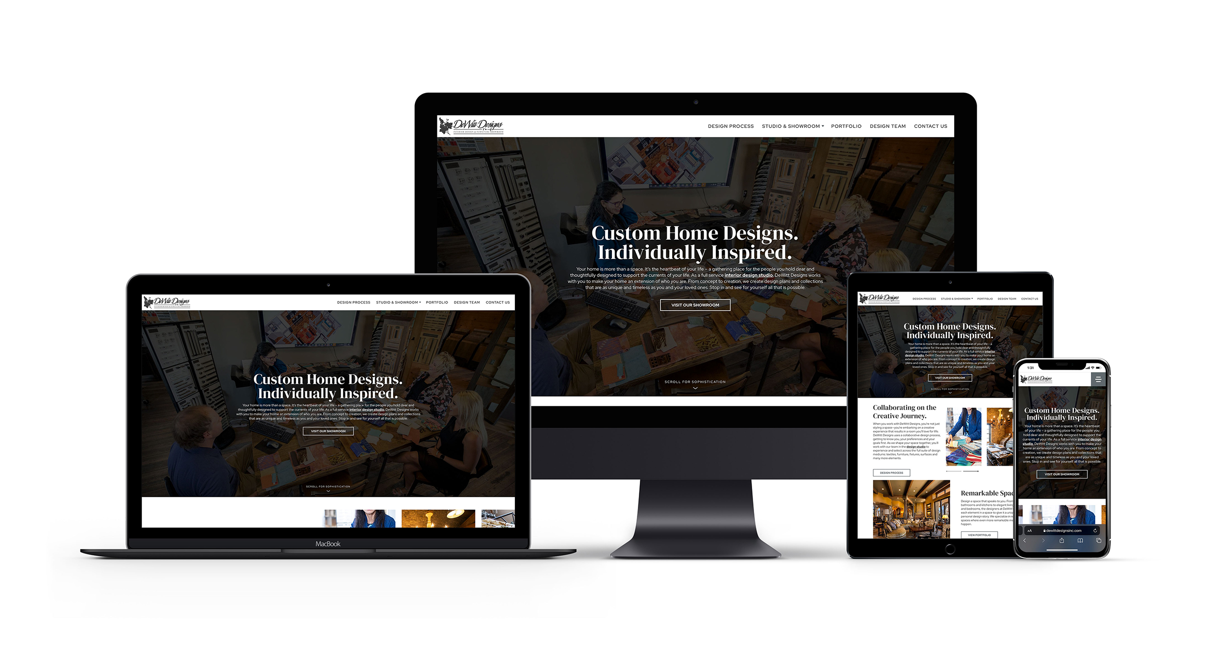
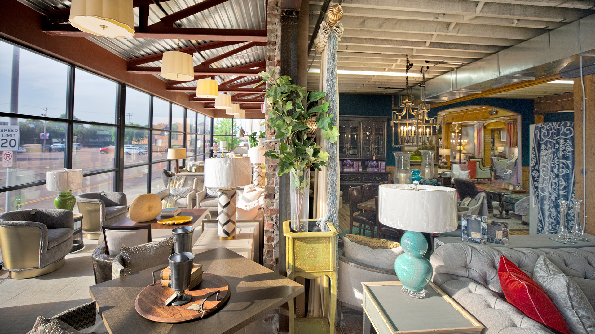
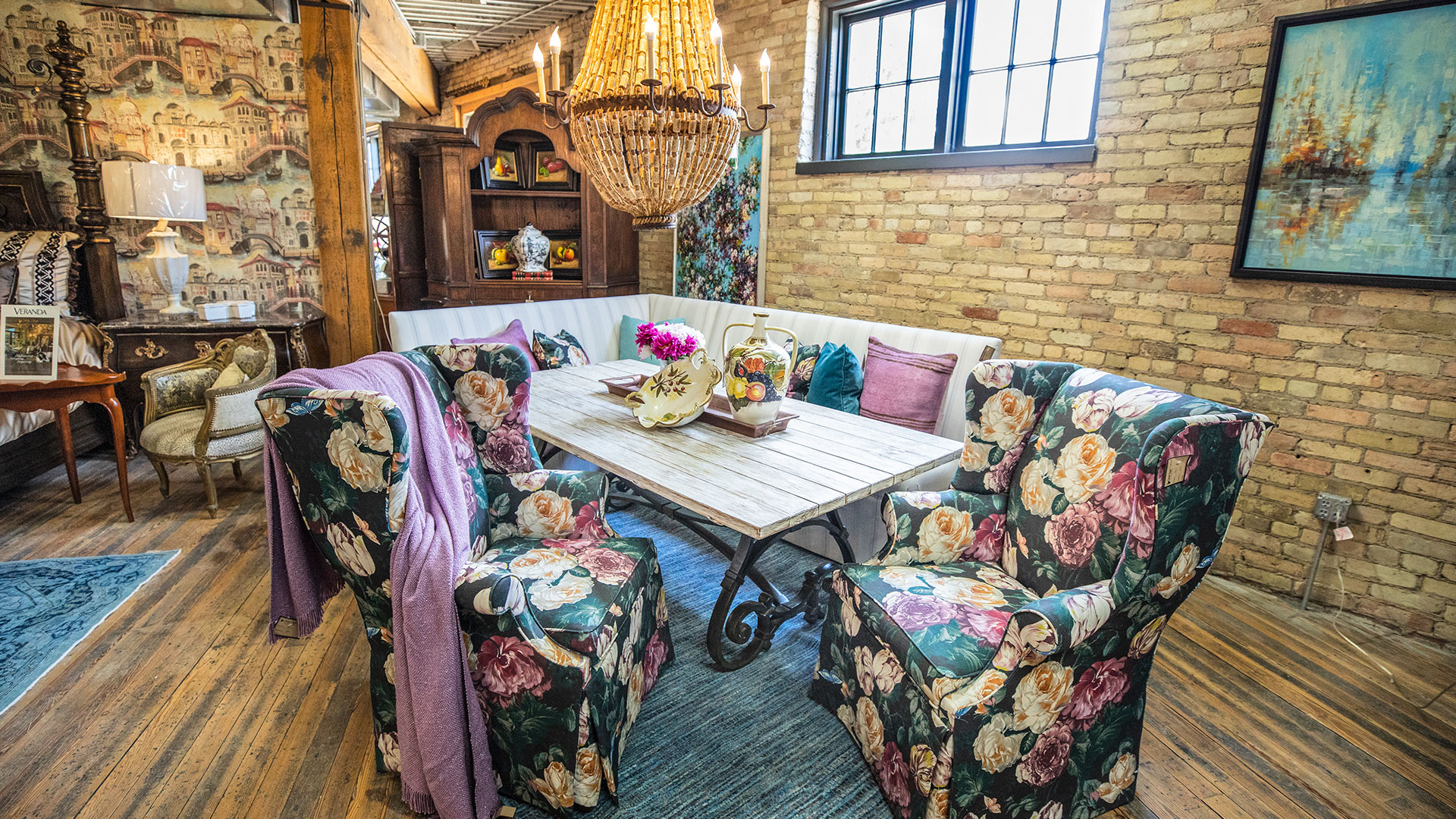
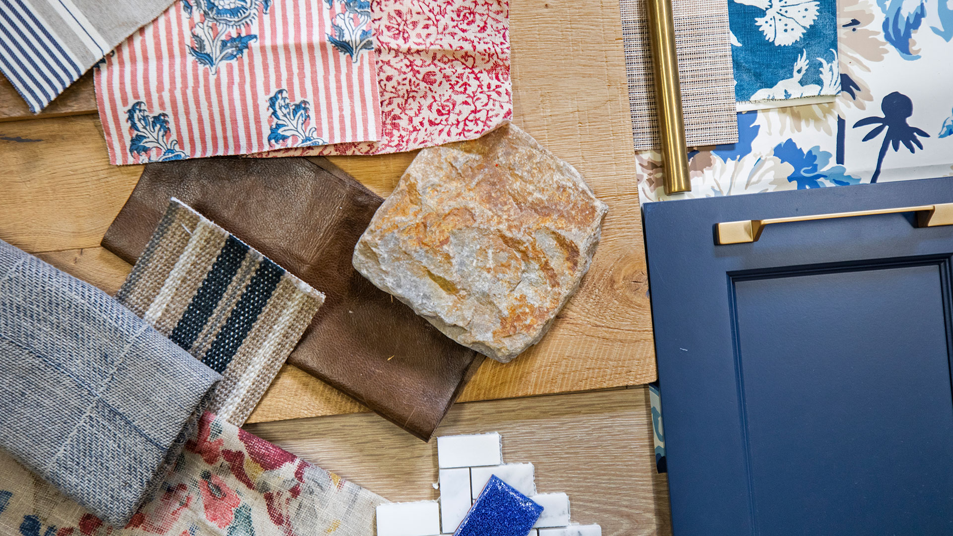
DeWitt Design is an interior design studio and furniture showroom located in Sioux Falls, SD. Their high-end services and quality products deserved a website that represented their sophisticated brand. The goal of the new website was to help users start the design process and give them answers to questions they may have about the brand—ultimately bringing them into the showroom.
Next
Prev
L&S first outlined the hierarchy of the sitemap to ensure an organized and clean website. The sitemap showed DeWitt’s product availability, informed customers about the designing process and encouraged customers to visit the store. The sitemap’s primary goal and what appeared to best suit the client’s needs was to lead online users to the contact page. Bringing customers to the door was our task; we knew DeWitt could make the sale from there with the personal shopping experience they offer.
VISIT BROOKINGS
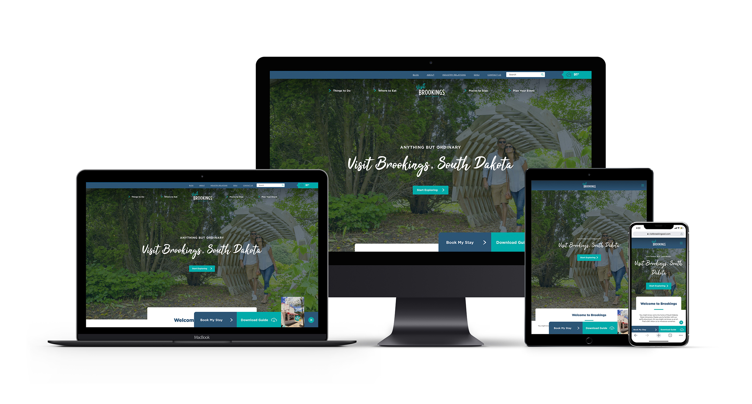
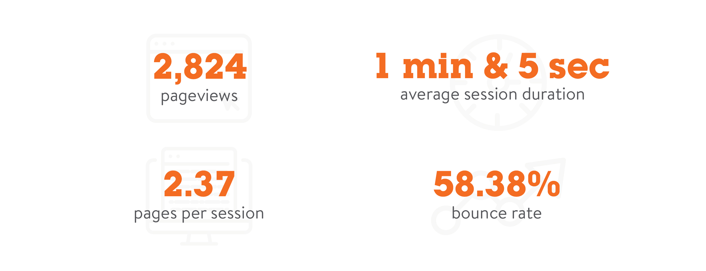
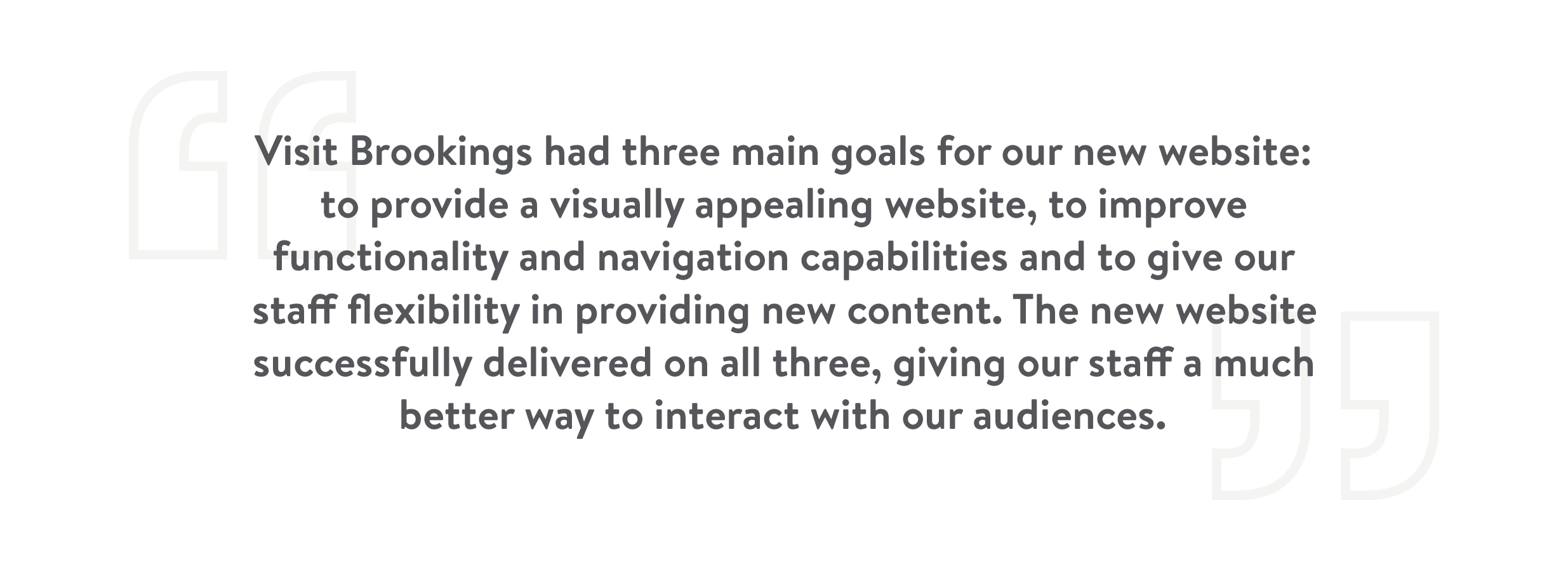
The visitbrookingssd.com website for the Brookings Chamber and Visitors Bureau was looking for a site that left a lasting impression, welcomed visitors and invited users to learn more. It was apparent that their new website needed to be focused on increasing engagement and providing tools for users to plan their next trip. We created travel personas and stories to map how people would use the site. With these unique users in mind, we also added a fresh navigation menu that included drop-down buttons to help visitors find what they’re looking for in a timely manner and home screen buttons to help users jump to relevant pages.
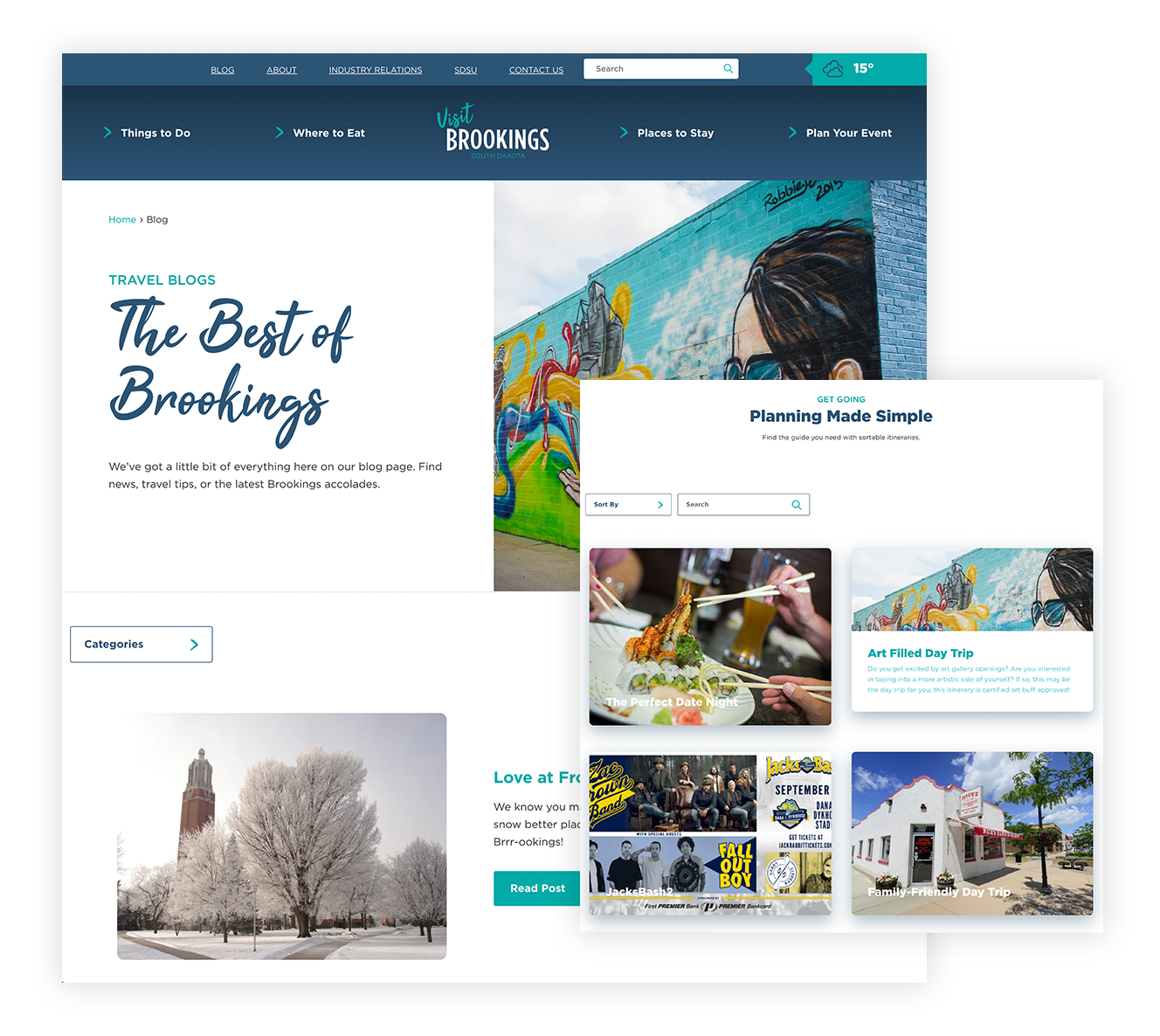
Next was the fun part. We added approachable content that brought Brookings’ hospitality to the forefront. This content included stories, blogs, high-impact imagery and targeted itineraries—not to mention the accessible and inclusive language that spoke to various audiences. Clear calls to action connected users to conversions, like easy-to-find links for hotels, and the new meeting planner page made creating an interactive events guide possible.
And poof! A beautiful, new website is born. Well, it’s easier said than done.