Our site uses cookies to customize your experience and help us analyze each crumb of web data.
LEARN MORE


UX & UI Tips to Increase Conversions
By Guest Blogger, Ashley Wilson
- 12.01.20
- 4 Min Read
The fields of user experience (UX) and user interface UI are on the rise. And there’s a good reason for this: websites and mobile apps that are easy for visitors to interact with achieve the best conversion rates.
Conversion rates have a big down-line effect on your entire business. Lower conversion rates mean you lose your profit margin and the ability to invest in business growth. When you achieve higher conversion rates, you can afford to keep up with the competition.
Let’s take a look at the various ways your conversion rate can be sabotaged if you’re not careful. That way, you can make adjustments and keep your leads, sales and users coming in strong.
OVERLOOKING VISITORS WITH DISABILITIES
With a little effort, you can make it easier for users with disabilities to access your app or website. There are a significant number of visitors who may experience issues regarding hand control or even vision. Allowing them to use your site unencumbered will benefit your company greatly.
When you accommodate visitors with disabilities and the elderly, you actually create better products. For instance, websites or apps with small fonts or low contrast are difficult for everyone and strain the eye.
Similarly, unclear messaging causes issues for people with dyslexia. The same goes for confusing layouts or visuals that are irrelevant to the text. When people who consume the content are in a hurry or stressed, or even when they’re not native speakers, clear and easy-to-read text is essential.
Best practices that accommodate users with disabilities will also benefit the general population, resulting in a better experience overall.
MESSY LAYOUT
When developing your app, product and service, you naturally want to employ advanced technology. However, your actual UX should be simple and straightforward.
Having a messy layout or navigation structure is a major mistake that sabotages conversion rates. People simply don’t have the patience for it.
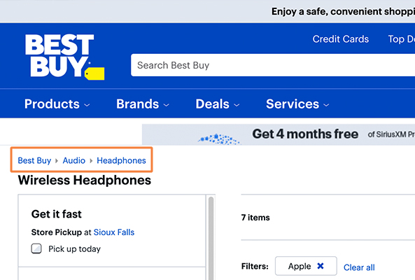
One great layout strategy is using breadcrumbs. Big companies like Walmart and eBay use these, and they help users know exactly where they are in your site or app structure.
You can use breadcrumbs in two ways:
LOCATION
These breadcrumbs show the users where they are on the site. The customer can use the navigation bar to switch between higher and lower categories. It can look like this: Main page > Sub Page > Item Category > Item.
ATTRIBUTE
Breadcrumbs can also provide meta-information. Such attributes are commonly used in E-commerce, where they serve to enable filtering products on the page. You can add products or content that interest the visitor using pre-existing categories.
Search Engine Optimization (SEO) is an important part of your online presence. Breadcrumbs help you maintain good SEO so your site doesn’t drop in the rankings due to high bounce rates.
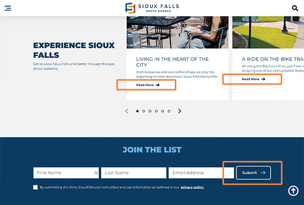
CALL TO ACTION (CTA) POSITIONING
If your call to action messages are unclear or you use too many, you’re bound to have lower conversion rates. There are several features that a CTA should have.
It needs to stand out from the rest of the content. The color, size and shape of the CTA should be unique so everyone can instantly see where it is. After all, everything on your page is driving people to take this action.
Don’t leave your CTA vague. It should be precise and to the point. When in doubt, “buy now”, “subscribe,” “learn more” and other simple CTAs work best. There is not much of a “trick” to getting people to take action—simply tell them what you want them to do.
NOT USING EMOTIONS
Emotions are crucial in online conversions. However, many UX and UI designers neglect to take this into account. This is a common issue because so many of those in technical fields tend to think logically.
In an ideal world, your customers would think just as logically when using your app or service as you did when you were building it. But people convert based on emotion, not so much logic. Of course, logic is still important. Backing up your claims with demonstrations and statistics is a great addition to your pitch. Still, it falls short of what emotions can do.
You can use a variety of emotions in increasing conversions. If you want to increase confidence in your app, use social proof (such as testimonials). Or, trigger the fear of missing out by running limited-time promotions.
Emotions provide truly limitless options—as long as you have an ethical product, you should use them to increase conversions.
MAKING VISITORS THINK TOO MUCH
The last thing you want to do is make users think more than they have to. Remember that people live busy lives. If they’re left wondering what to do next, then you haven’t done your job as a web designer or developer.
When you highlight the most important actions and features, you will funnel users to the solution that addresses their needs while supporting your business objectives. With too many choices, conversions tend to drop off.
Developing an app that makes things easier for the user is often a challenging process. However, it’s an excellent way to grow your business.
Just remember that you’re competing with others in the market. If you don’t take care of your audience, someone else will. So make sure you’re up to date on the latest requirements and tech trends to consistently provide an outstanding experience.
Ashley Wilson is a content creator, writing about business and tech. She has been known to reference movies in casual conversation and enjoys baking homemade treats for her husband and their two felines, Lady and Gaga. You can get in touch with Ashley via Twitter.