Work

MONUMENT HEALTH

/

Health & Wellness

BUILDING A LASTING BRAND

Two nurses walking and talking in a hospital hallway with medical equipment on walls.

Monument Health

Brand Identity

Despite its position as a leading health system, Regional Health faced years of negative perceptions and brand baggage. But with new leadership at the helm, the system was making big changes — including its name and brand.

Over two years, L&S conducted research with patients, non-patients, physicians and stakeholders to gauge perceptions of the health system and carve out unique opportunities for the brand’s new image. Should we focus on innovation or quality? Community or compassion? On this foundation, we built the Monument Health brand.
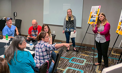
A woman presents ideas on a board while five people listen and discuss in a meeting room.
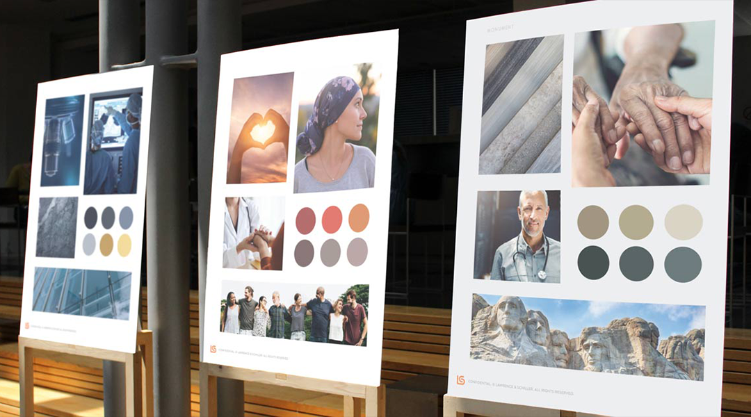
Three easels with posters showing images, color palettes, and photos of diverse people outdoors.Monument Health logo with gold diamond shapes above the company name on a dark teal background.

BEHIND THE BRAND

The Monument Health name speaks to dedication and stability while linking the system to its iconic Black Hills surroundings. We crafted the logo from five building blocks, each symbolizing one of the health system’s key priorities. By coloring in the three central diamonds, we also paid a subtle tribute to the previous brand mark: the heart and cradle.
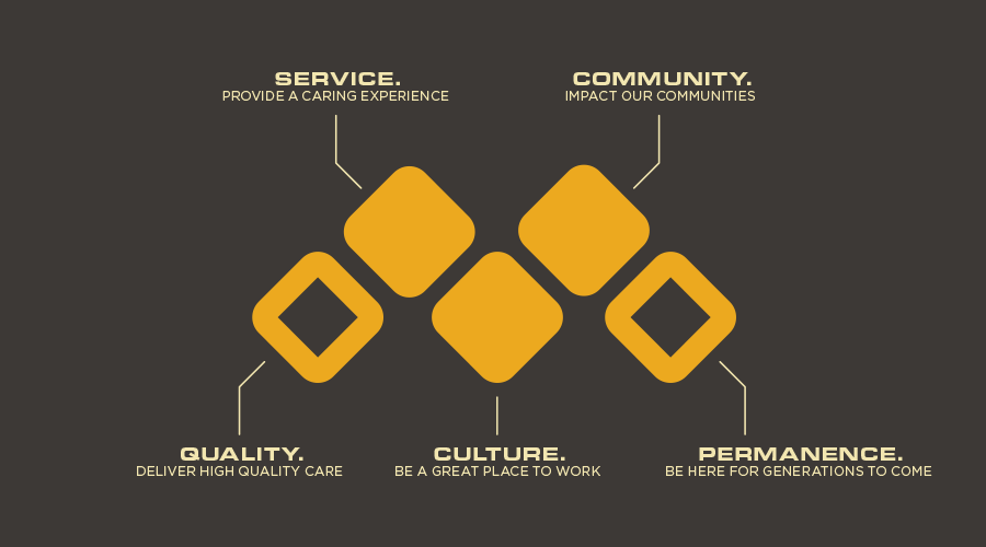
The Monument logo with five orange diamond shapes represent Service, Community, Quality, Culture, and Permanence with related phrases.
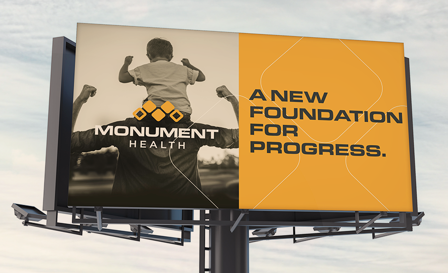
Billboard showing Monument Health logo and slogan 'A new foundation for progress' with child on man's shoulders.
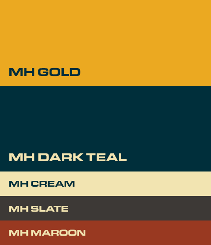
Brand elements of color labeled MH Gold, MH Dark Teal, MH Cream, MH Slate, and MH Maroon arranged vertically.
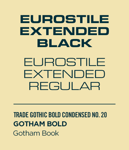
Text samples showing Eurostile Extended Black and Regular, Trade Gothic Bold Condensed, Gotham Bold, and Gotham Book.
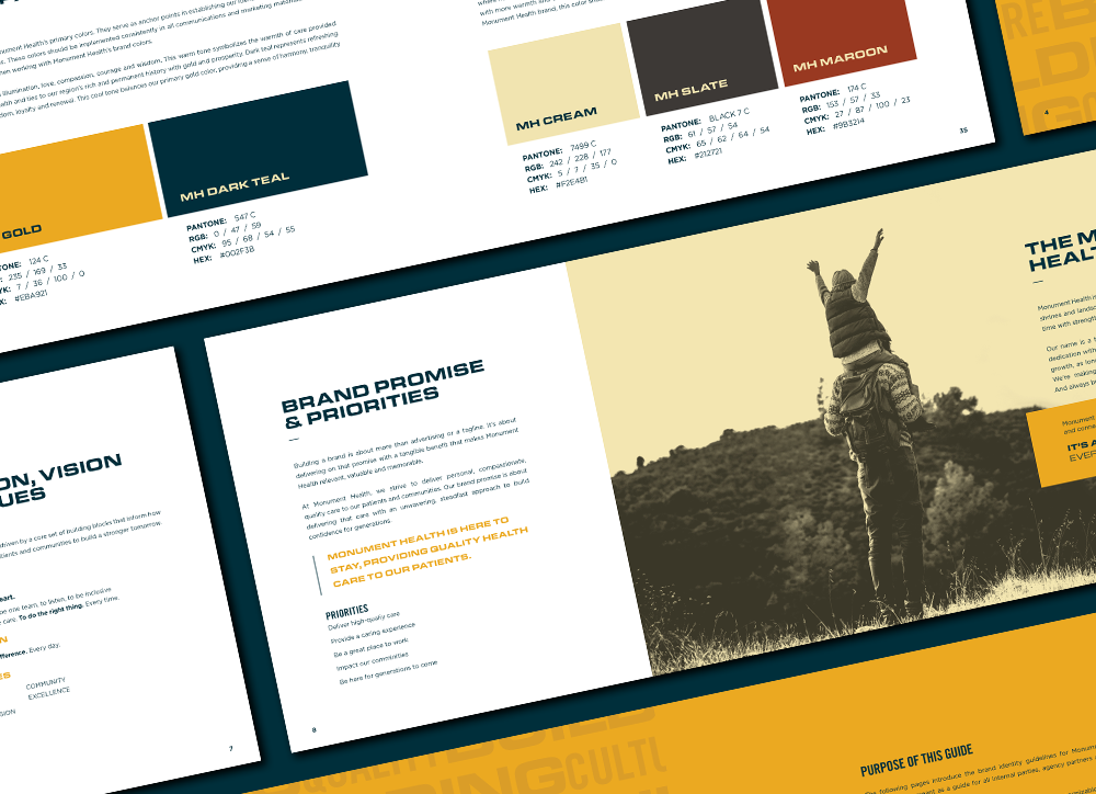
Open booklet showing brand colors, vision, and a photo of a child on adult's shoulders outdoors.
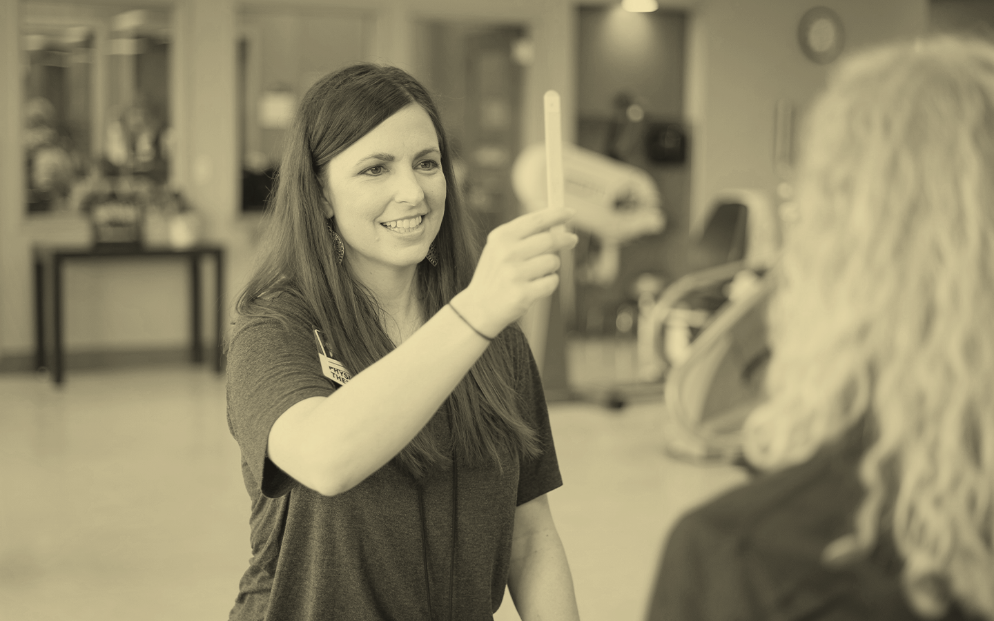
A smiling nurse performing an exam and a patient.

A New Brand Takes the Stage

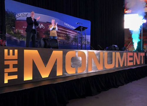
Large illuminated letters spelling THE MONUMENT on stage with two people clapping and smoke effects nearby.
When the time came for launch, we helped announce another milestone: naming rights for a new entertainment venue in the area, now branded as The Monument.
With the right research, direction and rollout plan as our guide, L&S helped Monument Health reposition its brand as a leader with a solid foundation of leadership and care.

Awards

American Advertising Awards Logo
Two smiling women working together at a computer in an office setting.
Dan Dismounts writing on a whiteboard with a marker in an office.

Like what you see?

Hit us up, we love a challenge.
Contact UsSee More work
SIGN UP

Emails you'll want to read

Thank you! Your submission has been received!
Oops! Something went wrong while submitting the form.

Latest Articles

View All
Micah Aberson
L&S Studio Website
AAA awards